Cinematic Color Grading AI: Create Film-Level Mood Through Light and Tone
Cinematic color grading is not really about making an image more colorful. It is about making you feel something when you look at it.
A cooler shadow can make a scene feel distant or tense. Warm highlights can make the same image feel softer, calmer, or even nostalgic. Sometimes the change is barely noticeable, but it can completely alter the mood.
That is what makes cinematic color grading interesting. You are not just changing colors—you are deciding where the viewer’s attention goes and what kind of atmosphere the image should have.
I have found that simply pushing saturation or contrast rarely gives the result you want. It usually works better to first think about the light: where it is coming from, what should stand out, and which parts of the frame can be allowed to fall back.
AI image tools make this easier to experiment with. I used ChatGPT’s image-generation tools for these examples, but you can try the same ideas with other image generators such as Nano Banana, Flux, Midjourney, Gemini, or whichever tool you normally use.
The prompts below focus on the things that tend to make a cinematic grade feel convincing: light direction, shadow color, highlight warmth, contrast, depth, and restraint.Seeing the Frame Before You Grade It
Before changing anything, take a second to look at the image.
Where does your eye go first?
That area is usually worth protecting. Rather than changing the entire frame, try making that focal point slightly stronger while allowing less important areas to become quieter.
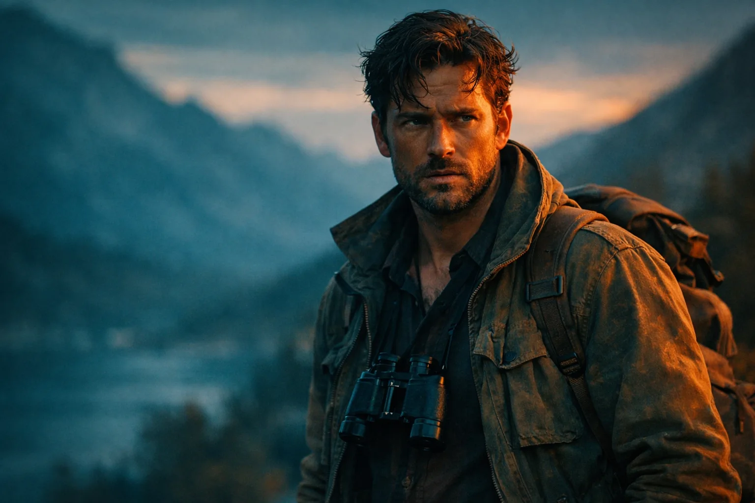
A lot of cinematic images also rely on contrast between tones. Cool shadows and warmer highlights are a familiar combination, but they are not a rule. A muted palette can sometimes feel much more cinematic than a heavily saturated one.
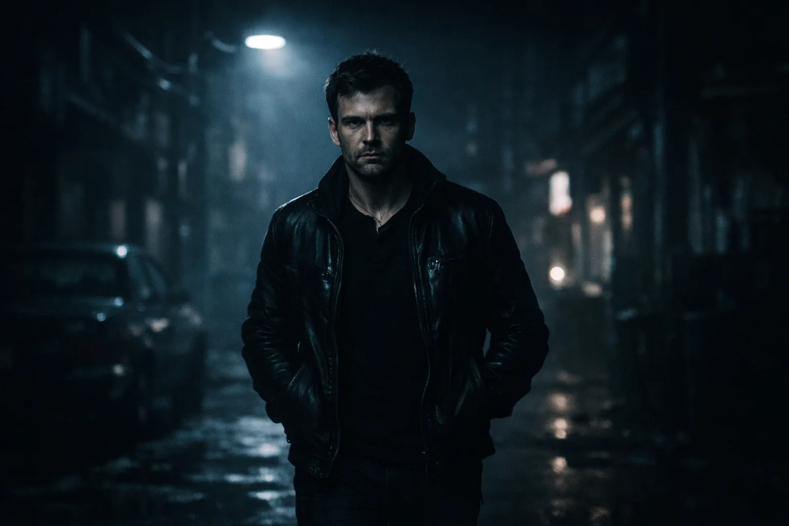
Depth is another small detail that makes a difference. Background elements often need less contrast or saturation than the subject. When everything has the same visual intensity, the image can feel flat.
The trick is knowing what not to change.Cinematic Color Grading AI Prompts
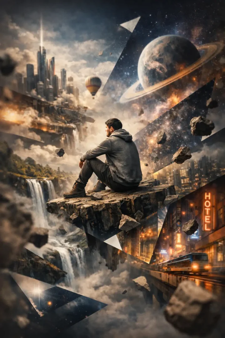
Teal and Orange Cinematic Balance
Low-Key Cinematic Depth
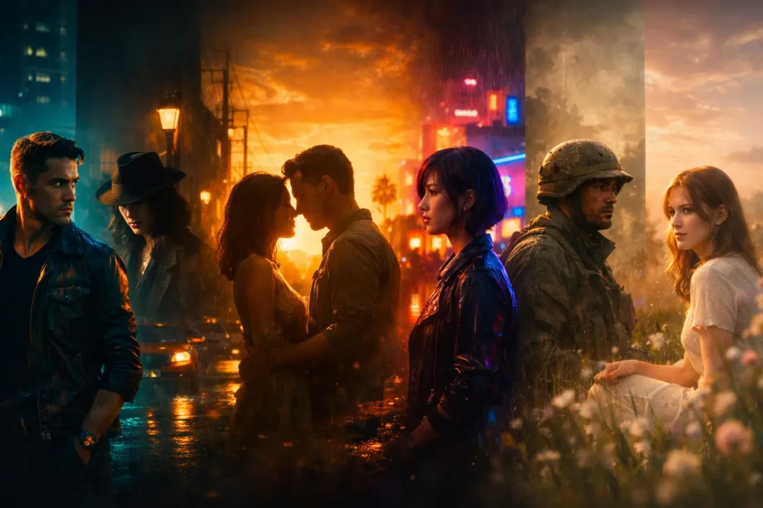
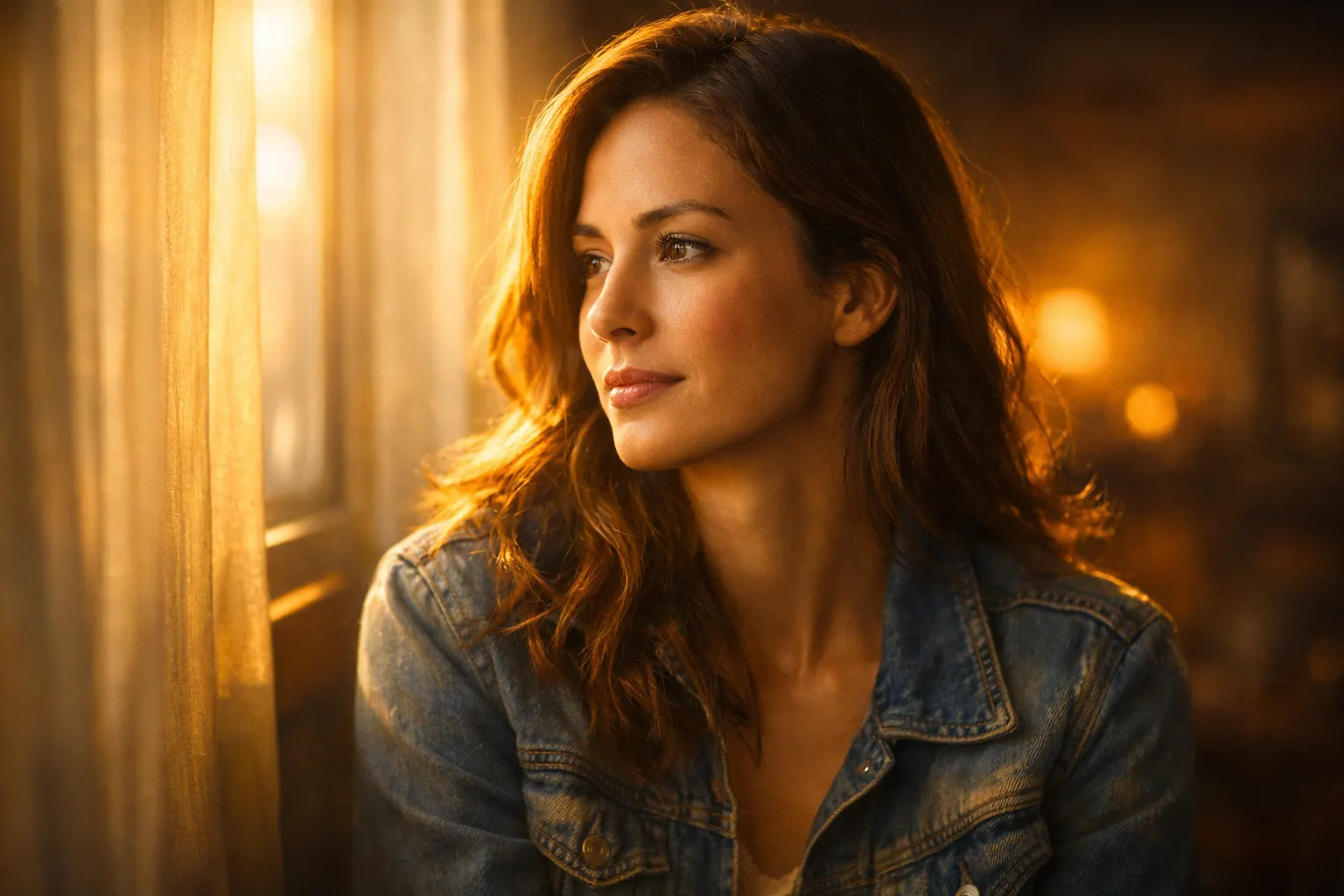
Golden Hour Cinematic Warmth
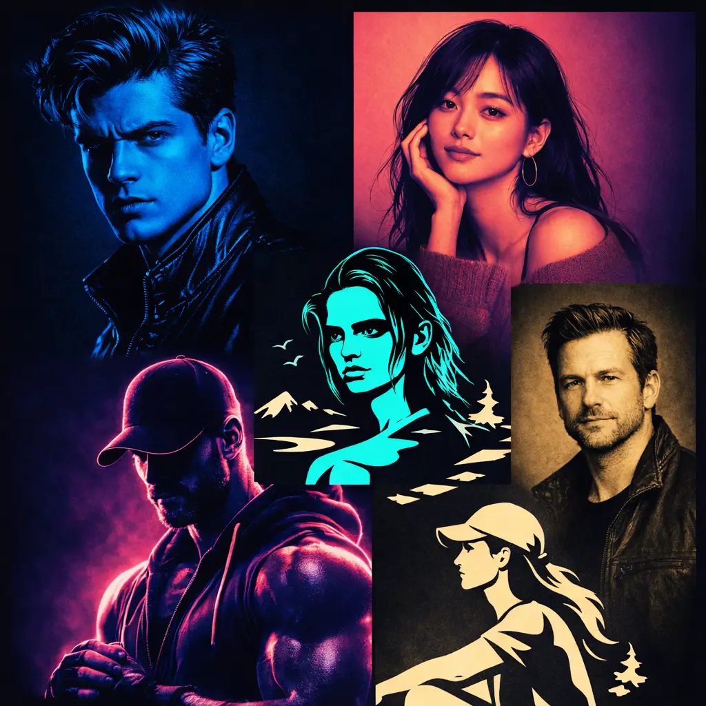
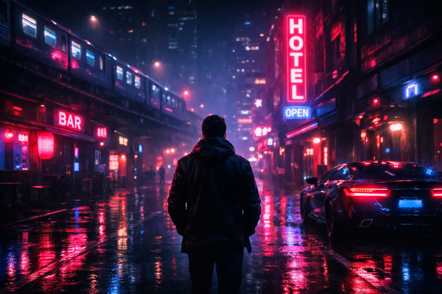
Neon Cinematic Night Look
Muted Cinematic Realism
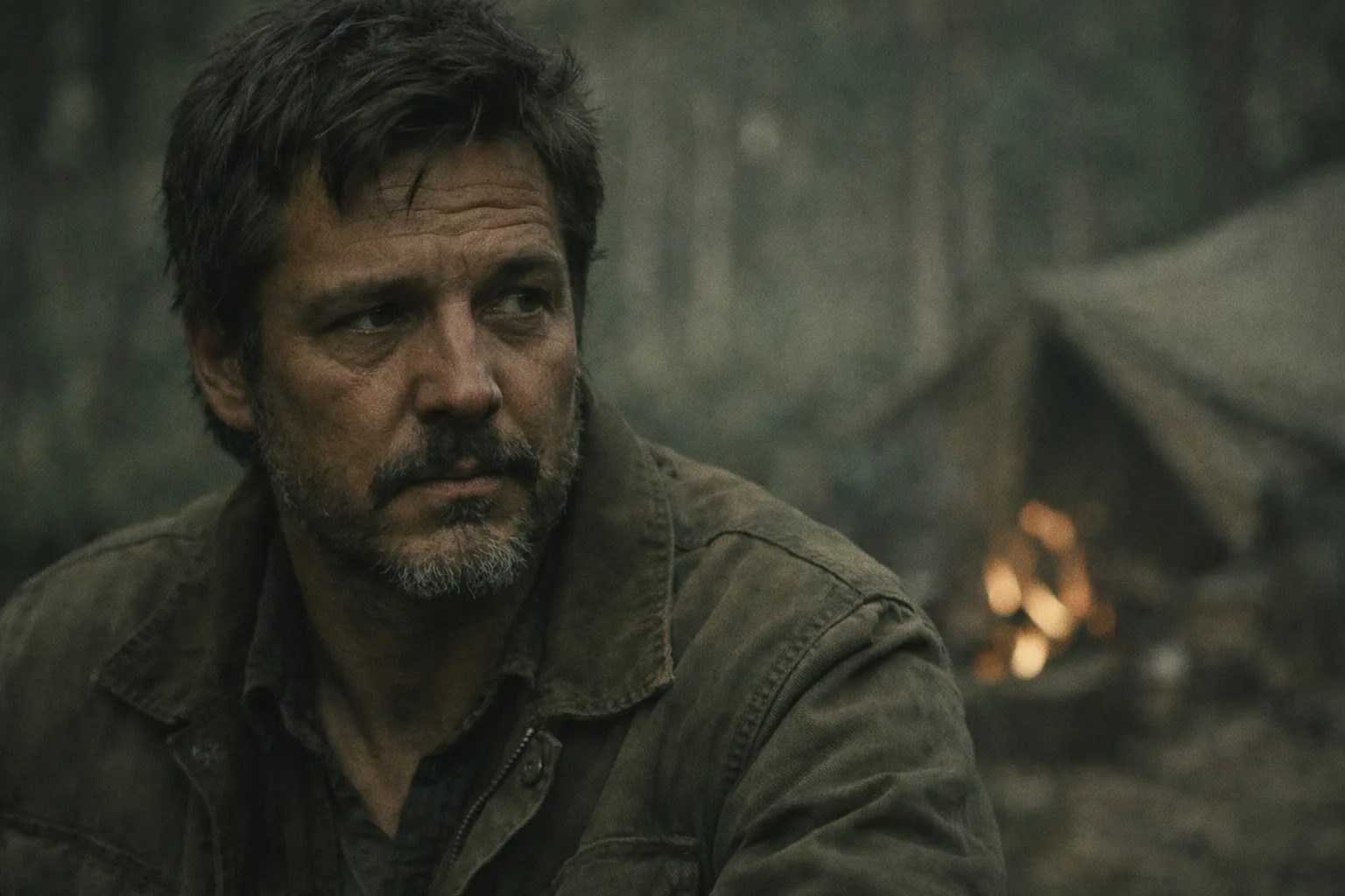
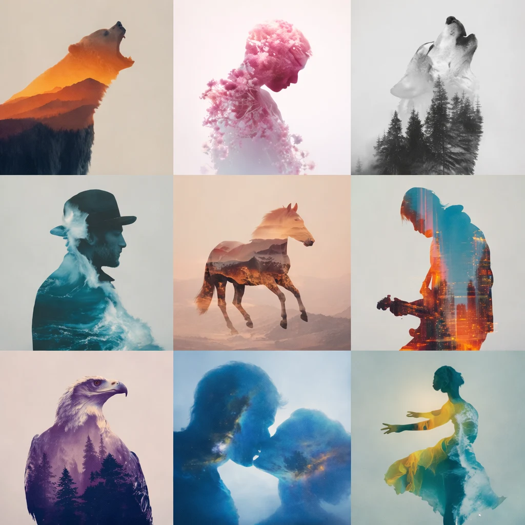
Soft Indie Cinematic Tone
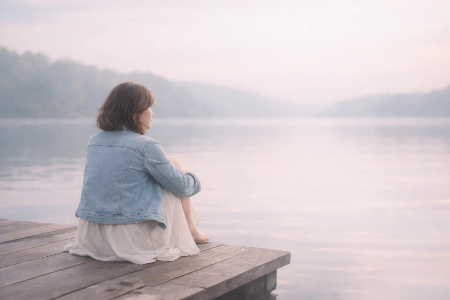
A Few Things I Would Watch
One mistake I would avoid is trying to make every part of an image cinematic at once.
Start with the subject. Then look at the background. Then decide what needs to become quieter.
Also, don’t assume that more grain, more contrast, or more color automatically makes an image look more like a film. Those effects can become noticeable very quickly.
For me, the better cinematic grades are often the ones where you notice the mood before you notice the grading.Which AI Tool Can You Use?
I used ChatGPT’s image-generation tools for these examples.
You can also experiment with Nano Banana, Flux, Midjourney, Gemini, or another image-generation tool you already use. The same prompt may produce different results across models, especially with subtle color relationships and lighting.
You don’t need to use one particular tool to understand the technique. The useful part is learning how to describe the light, shadows, highlights, contrast, and depth you want.Conclusion
Good cinematic color grading is usually less about adding something and more about deciding what deserves attention.
Warm the right highlight. Let an unimportant background fall away. Keep the skin natural. Give the shadows a little character.
Those small choices can change the entire feeling of a frame.
Copy the prompts, experiment with the look, and see which grade fits your image rather than trying to force every image into the same cinematic style.FAQs
What is cinematic color grading in AI image generation?
Cinematic color grading is the process of shaping an image’s mood through color, contrast, shadows, highlights, and light. In AI image generation, these qualities can be described directly in a prompt to guide the overall visual tone.
What should I include in an AI prompt for cinematic color grading?
A useful prompt can describe the shadow color, highlight color, contrast, lighting direction, saturation, depth, atmosphere, and overall mood. You don’t need to mention every possible effect; the important part is describing how the light and tones should work together.
How do I make an AI-generated image look more cinematic?
Focus on controlled lighting and tonal separation rather than simply increasing contrast or saturation. Describing cooler shadows, restrained highlights, realistic light falloff, atmospheric depth, and natural midtones can produce a more convincing cinematic look.
What is the best color combination for a cinematic AI image?
There is no single best combination. Teal and orange is popular, but muted greens and browns, warm amber highlights, cool blue shadows, or soft pastel tones can also work depending on the mood you want.
Can I use these cinematic color grading prompts with other AI image generators?
Yes. You can adapt the prompts for tools such as ChatGPT, Nano Banana, Flux, Midjourney, Gemini, and other image-generation platforms. The same prompt may produce different results because each model interprets lighting and color differently.
How do I keep skin tones natural when using cinematic color grading?
Keep the midtones relatively neutral and avoid pushing the entire image toward one color. You can tint the shadows and highlights while asking the model to preserve natural skin texture and realistic skin tones.
Why does my cinematic AI image look overprocessed?
Too much saturation, contrast, glow, grain, or colored lighting can make an image look artificial. Try reducing the intensity of those effects and give the subject clearer tonal separation from the background.
Can I use cinematic color grading prompts on an existing photo?
Yes. If the image-generation tool supports image references or image editing, you can provide an existing photo and describe the desired lighting, color palette, contrast, and atmosphere while keeping the original subject as the reference.
Is teal and orange necessary for a cinematic look?
No. Teal and orange is simply one familiar cinematic palette. A restrained or muted color treatment can sometimes look more natural, especially for documentary, indie-film, lifestyle, or emotional scenes.
What makes a cinematic color grade feel realistic?
Consistency is the biggest factor. The colors should make sense with the direction and quality of the light. Shadows, reflections, highlights, and atmospheric depth should feel as though they belong to the same environment rather than being added independently.
About Author
Manas Ranjan Behera
I’m Manas Ranjan Behera, a creative designer and AI Visual Strategist, and the creator of PortrayMedia.
I combine design, branding, advertising, and generative AI to create purposeful visual content. Through PortrayMedia, I share practical AI prompts, creative ideas, and visual techniques for designers, marketers, and creators.
AI creates possibilities. Creativity gives them purpose.