Minimal Typographic Logos: 6 AI Prompts for Wordmarks
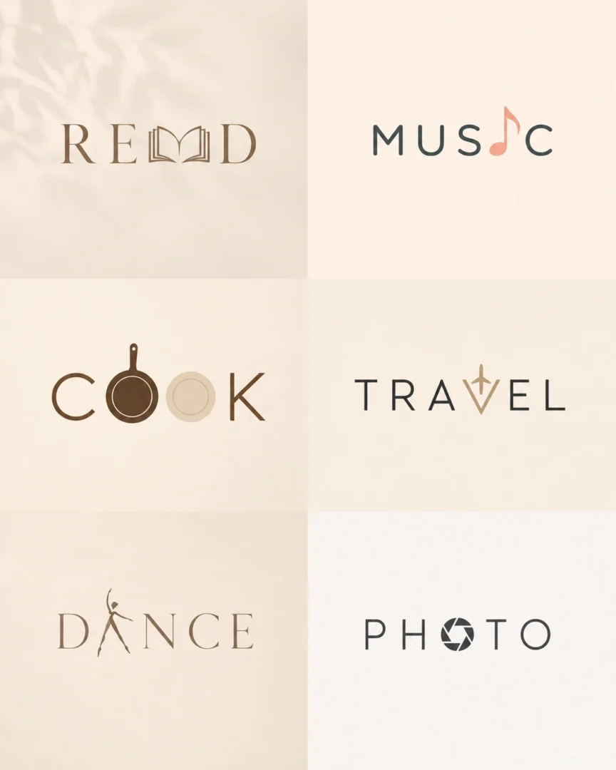
These six AI prompts create minimal typographic logos, built from lettering rather than symbols. The examples spell READ, MUSIC, COOK, TRAVEL, DANCE and PHOTO.
To use your own word, replace the word in quotes. Short words are easiest, because AI often misspells or distorts letters. Treat the result as a concept: rebuild your final logo in a vector tool, and check that the name and design are clear to use before you adopt it.
6 Minimal Typographic Logo Prompts
READ Editorial Logo
MUSIC Rhythm Wordmark
COOK Culinary Logo
TRAVEL Explorer Identity
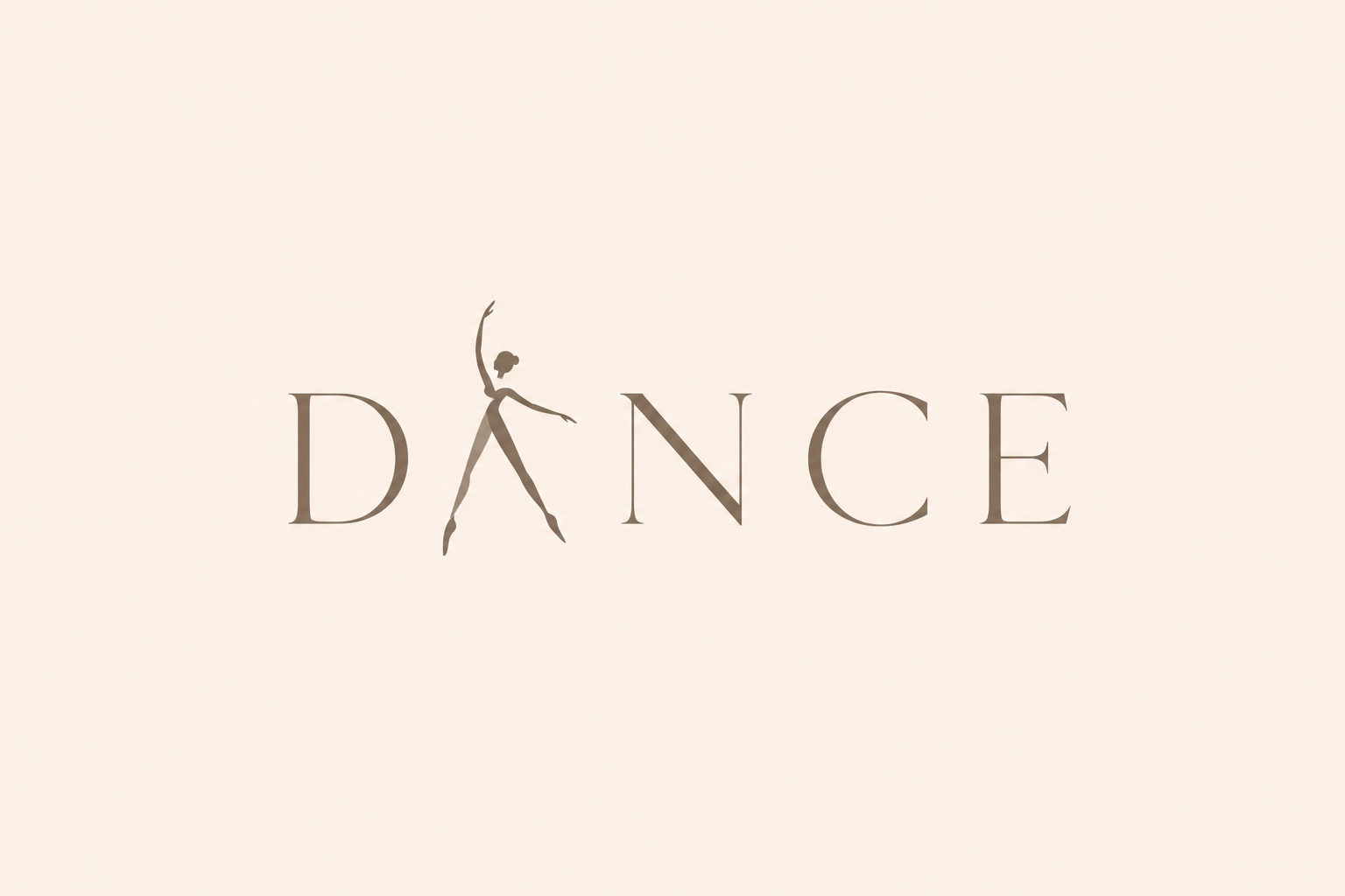
DANCE Elegant Wordmark
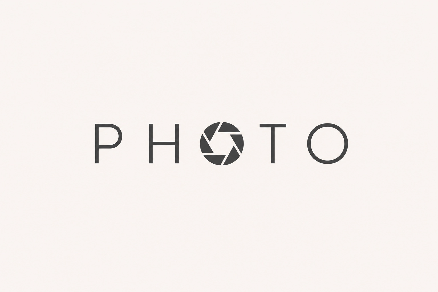
PHOTO Studio Logo
Frequently Asked Questions (FAQs)
What is a minimal typographic logo?
A minimal typographic logo is built around lettering instead of decorative graphics. Rather than relying on flashy icons or visual effects, it uses carefully designed typography to express a brand’s personality. That’s why you’ll often see this style used by luxury brands, creative studios, and modern startups that want a clean, lasting identity.
Why are designers using AI for typographic logo ideas?
AI speeds up the creative process. Instead of staring at a blank canvas, designers can generate multiple directions in minutes using detailed prompts. The strongest results usually come from prompts that describe typography, spacing, composition, and brand personality—not just the font style.
Which AI tools work well for minimal logo design?
Popular choices include ChatGPT Image Generation, Midjourney, Flux, Leonardo AI, and Nano Banana. Each produces a different visual style, so many designers experiment with several tools before refining the final logo in professional design software.
Can an AI-generated logo become a real brand logo?
Yes. Many businesses use AI-generated concepts as the starting point for their branding. The selected design is usually refined by adjusting the typography, spacing, proportions, and scalability before it becomes the final logo.
What gives a typographic logo a premium feel?
Luxury branding isn’t about adding more elements—it’s about removing anything unnecessary. A premium logo usually has consistent spacing, balanced proportions, restrained colors, excellent readability, and subtle details that reveal themselves over time instead of demanding attention immediately.
How can I write a better AI logo prompt?
Think like an art director rather than a software user. Describe the brand’s personality, audience, typography style, composition, negative space, mood, lighting, color palette, and overall visual direction. The clearer your creative brief, the more useful the generated concepts will be.
Do minimal logos help with branding?
Yes. A simple logo is easier to recognize, easier to remember, and easier to use consistently across websites, packaging, social media, business cards, and mobile apps. Consistency builds familiarity, and familiarity is one of the strongest drivers of brand trust.
Conclusion
Design trends come and go, but well-crafted typography rarely feels outdated. That’s one reason minimal wordmarks continue to appear across luxury fashion, architecture firms, creative agencies, and technology startups. They don’t compete for attention—they earn it through clarity and confidence.
If you’re using AI to generate logo concepts, treat the prompt as your creative brief rather than a list of keywords. Better direction leads to better ideas, and the strongest branding usually comes from refining those ideas—not from choosing the very first image the AI produces.
More in AI Graphic Design Prompts
This guide is part of our AI Graphic Design Prompts hub, where you’ll find every related guide, along with tips and common questions.