

These AI prompts create posters led by type or a single bold idea: custom text designs, liquid chrome and neon lettering, motivational quote layouts and minimal poster art. AI can still misspell words, so short phrases of one to five words work best. Check every letter before you print or share.
What’s on This Page
| Section | Prompts | Best for |
|---|---|---|
| Typography posters | 6 | Your own words as wall art |
| 3D, Chrome and Neon Lettering Prompts | 6 | Logos and thumbnails |
| Motivational Quote Poster Prompts | 6 | Layouts with clear hierarchy |
| Minimal Poster Prompts | 6 | Bold, simple wall art |
| Split Photo Flat Typography Prompts | 6 | Posters mixing a photo and type |
Use a tool that handles text well, such as ChatGPT or Nano Banana. AI can still misspell words, so short phrases of one to five words work best. Check every letter before you print or share.
Where Typography Posters Work
The style changes how the same words feel. Bold letters feel confident, and handwriting feels more personal.
- At home: wall art, workspace prints, wallpapers and gifts
- For business: branding visuals, social content, café signs and promotional artwork
For anything you plan to sell or use commercially, check your tool’s terms first.
6 AI Prompts for Typography Posters
Replace <TEXT> with your words and <AR> with your size, such as 4:5 for a poster or 9:16 for a phone.

Minimal Modern Poster
Replace the highlighted text with your own details before you run the prompt.

Neon Glow Style
Replace the highlighted text with your own details before you run the prompt.

Handwritten Artistic Look
Replace the highlighted text with your own details before you run the prompt.

Bold 3D Lettering
Replace the highlighted text with your own details before you run the prompt.

Nature-Inspired Typography
Replace the highlighted text with your own details before you run the prompt.

Abstract Creative Layout
Replace the highlighted text with your own details before you run the prompt.
3D, Chrome and Neon Lettering Prompts
These six AI typography prompts create liquid chrome, kinetic, 3D extruded, neon, abstract and double exposure lettering. Replace [TEXT] with your word or phrase, then generate in ChatGPT, Midjourney, Leonardo AI or Stable Diffusion.
AI tools can misspell letters, so short words work best. Check the spelling on every result. Abstract styles are the hardest to read, so test your word at small size before you use it on a logo or thumbnail.
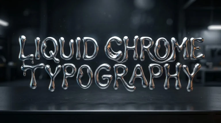
Liquid Chrome Typography
Replace the highlighted text with your own details before you run the prompt.
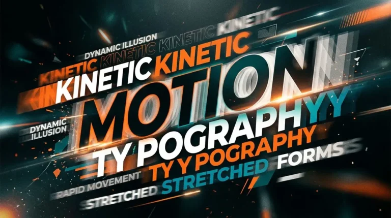
Kinetic Motion Typography
Replace the highlighted text with your own details before you run the prompt.
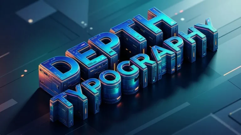
3D Extruded Depth Typography
Replace the highlighted text with your own details before you run the prompt.
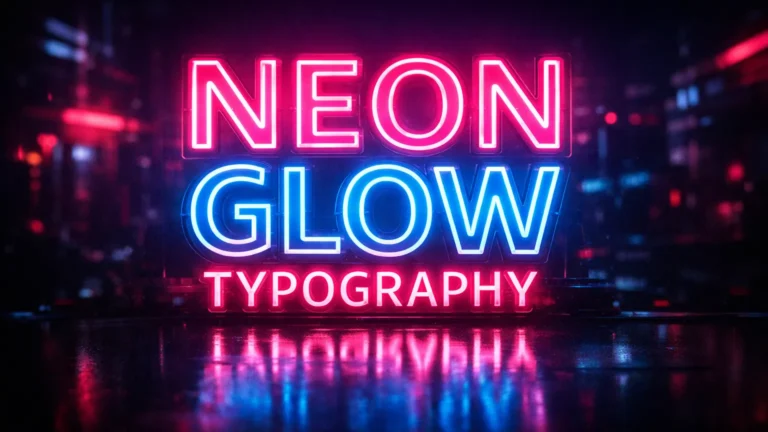
Neon Glow Typography
Replace the highlighted text with your own details before you run the prompt.
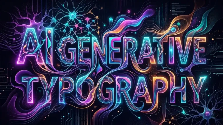
AI Generative Abstract Typography
Replace the highlighted text with your own details before you run the prompt.
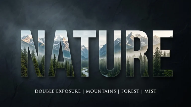
Double Exposure Nature Typography
Replace the highlighted text with your own details before you run the prompt.
Motivational Quote Poster Prompts
These six AI prompts create motivational quotes posters in distinct layouts, from a single dominant word to a Swiss grid and dark cinematic type. Each one includes a sample quote that you can replace with your own.
A quote poster depends on hierarchy, meaning which words people read first. The size, weight and position of the words matter more than the background, so give the key word the most space. Short quotes are the easiest for AI to spell correctly, and you can add longer text in a design tool afterwards.
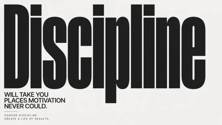
Dominant Word Impact
Replace the highlighted text with your own details before you run the prompt.
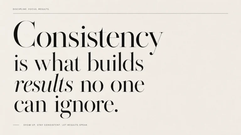
Luxury Editorial Minimal
Replace the highlighted text with your own details before you run the prompt.
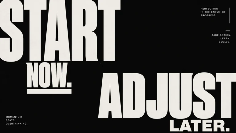
Asymmetric Power Layout
Replace the highlighted text with your own details before you run the prompt.
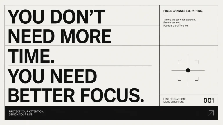
Grid-Perfect Swiss Design
Replace the highlighted text with your own details before you run the prompt.
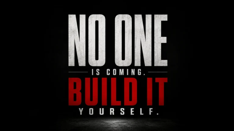
Dark Cinematic Typography
Replace the highlighted text with your own details before you run the prompt.
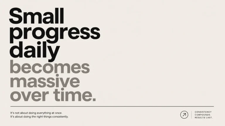
Clean Modern System
Replace the highlighted text with your own details before you run the prompt.
Tips for Better Results
- Generate several versions of a prompt and choose the clearest layout.
- Limit the colours to one or two tones so the words stand out.
- Check every word for spelling errors.
- Test the poster at phone size, since many people will see it there.
- Use the same shape for every poster in a series.
Minimal Poster Prompts
These six AI prompts create a minimalistic poster with one main subject, flat colour and plenty of empty space. The subjects include a lion, a supercar, a city reflection and a robot.
Use them in ChatGPT, Nano Banana or Flux. If a result feels busy, remove background details rather than adding more instructions.
For wall art, choose the 2:3 or 4:5 shape in your tool. AI images may need upscaling for a sharp large print.
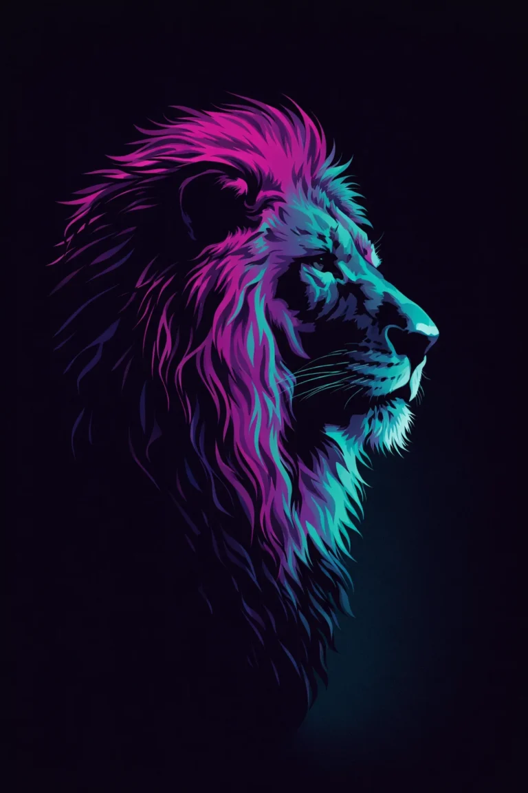
Minimal Lion Portrait Poster (Neo-Pop Gradient Style)
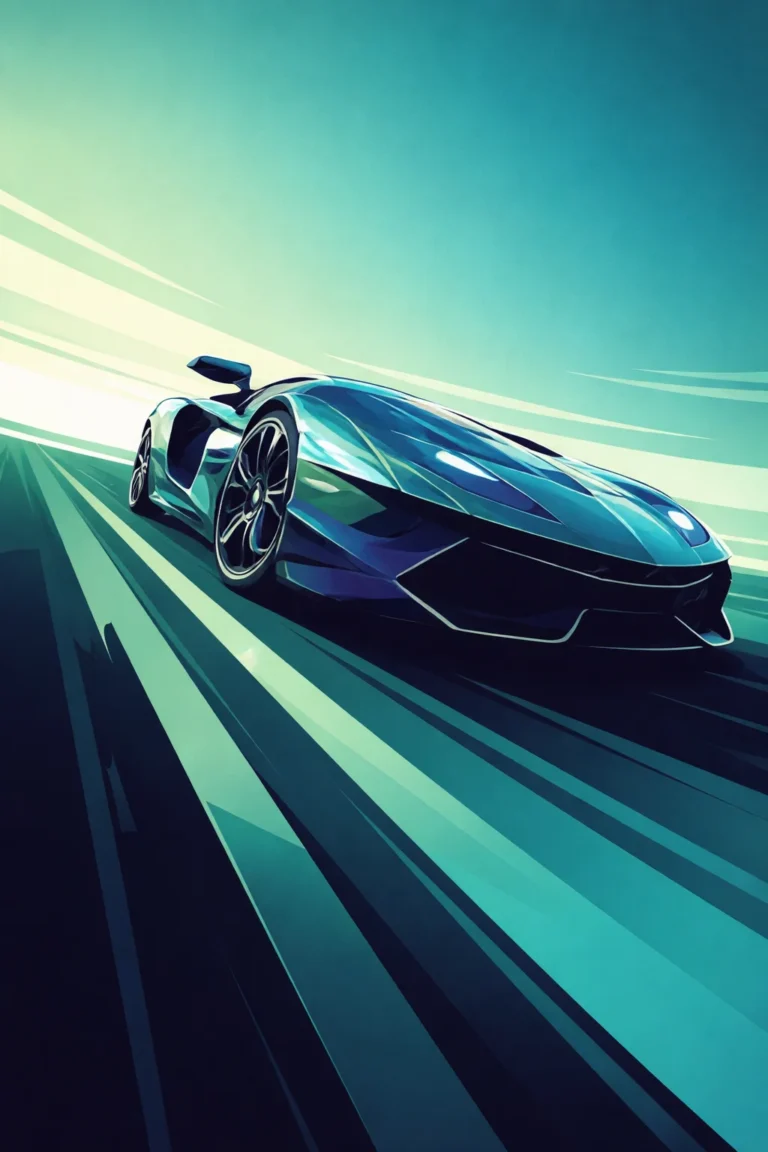
Futuristic Supercar Motion Poster
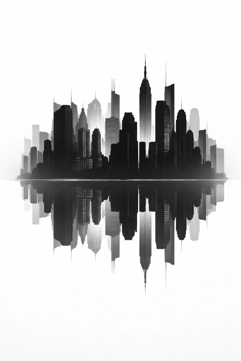
Monochrome City Reflection Poster
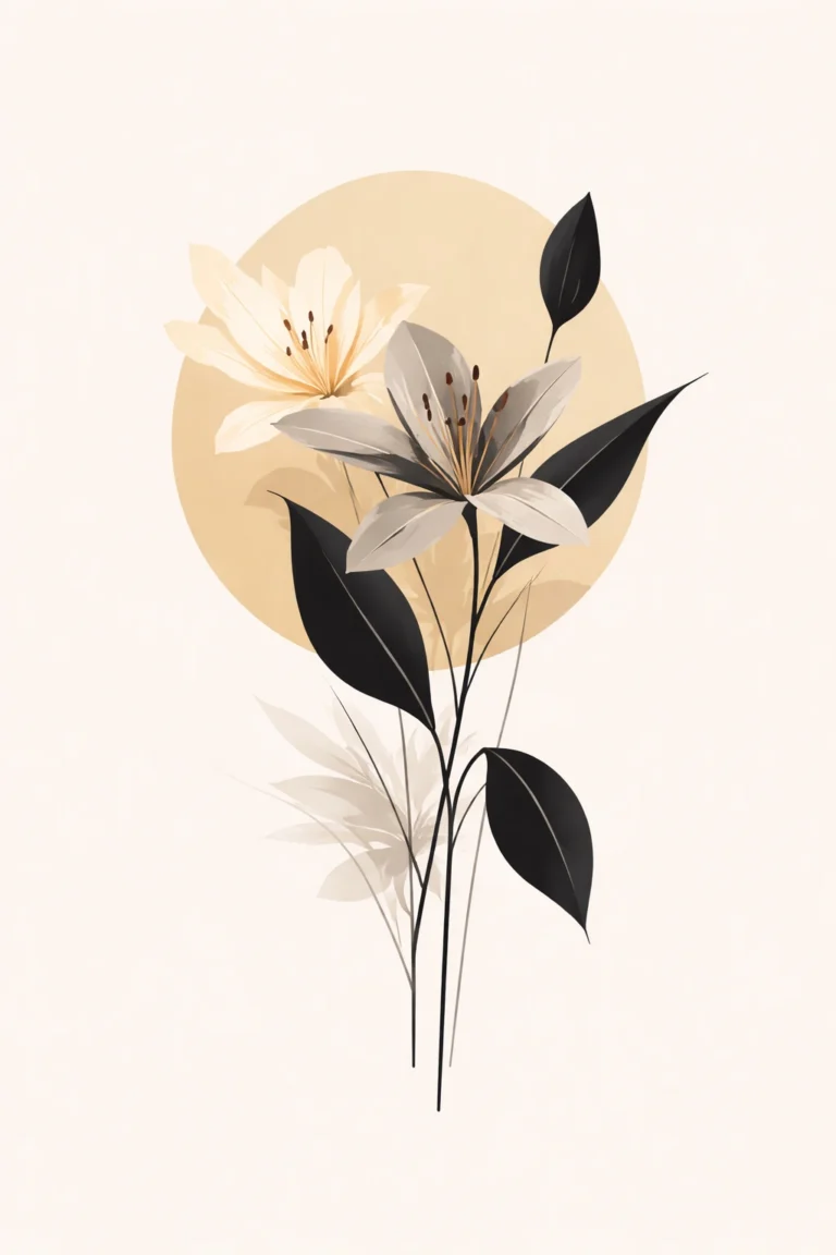
Botanical Minimal Floral Poster
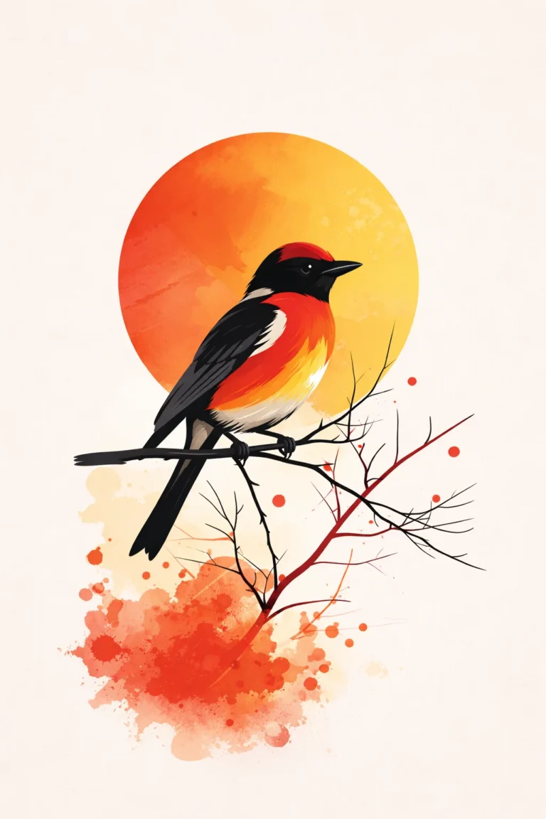
Vibrant Bird & Sun Graphic Poster
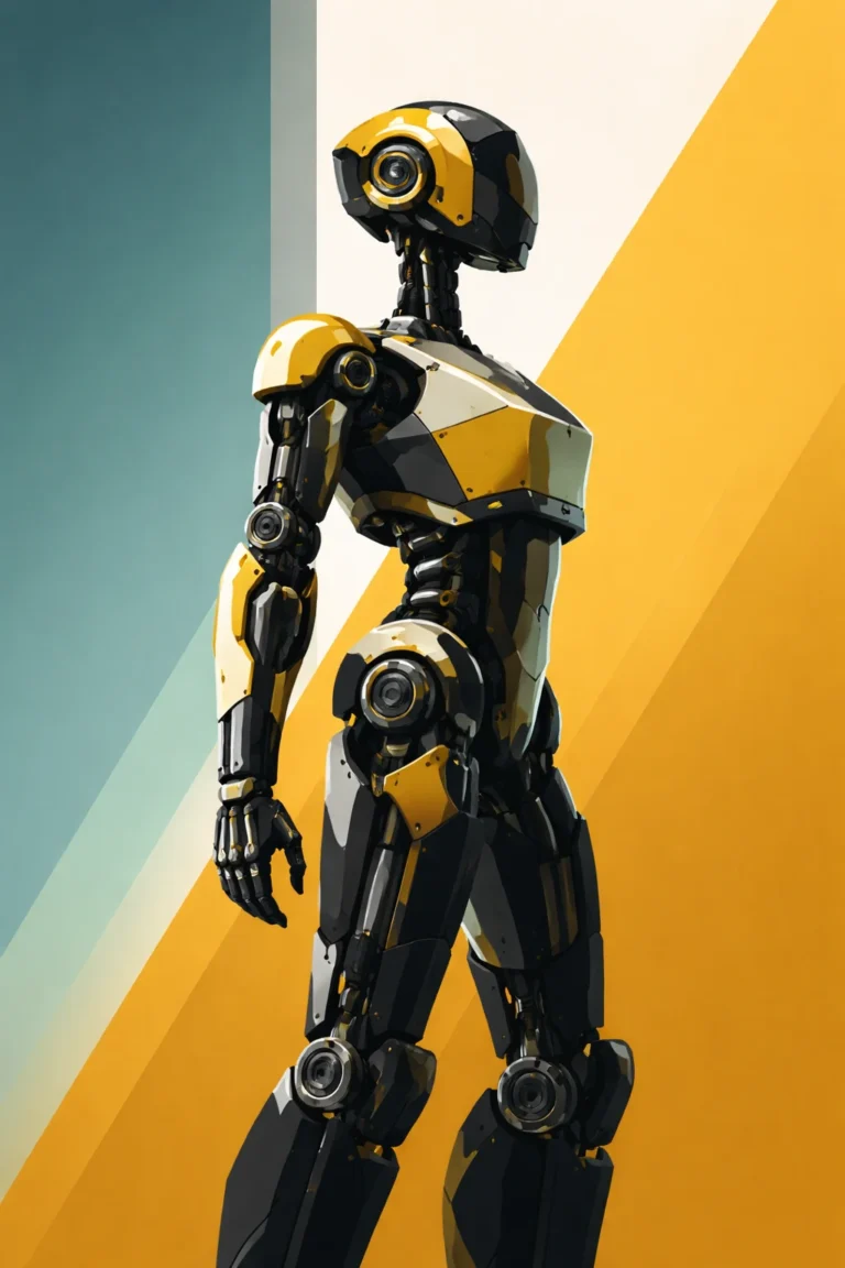
Futuristic Robot Editorial Poster
Split Photo Flat Typography Prompts
A product poster does not need five visual effects, a complicated background and several decorative elements to attract attention. Sometimes, one product, one carefully chosen colour and a strong typographic layout can do more.
That is the idea behind split photo flat typography. The product and the lettering share the same visual space, rather than behaving like two separate elements. A sneaker cuts through a giant word. A camera lens becomes part of a letterform. Sunglasses interrupt oversized fashion typography without making the brand name disappear.
The interesting part is not simply placing a product over text. The design depends on how the two elements fit together. A product that covers too much of a letter can make the brand name difficult to read. A product that sits too far away from the typography can make the composition look like an ordinary advertisement.
AI image prompts can help define this relationship before an image is generated. They give the image model instructions about the product, typeface, background, spacing, lighting and the way the object interacts with the letters. However, the prompt still needs a clear visual direction. Adding more adjectives does not necessarily produce a better poster.
The six prompts below use familiar product categories to demonstrate different approaches to split photo flat typography, from sports advertising and consumer electronics to luxury fashion and audio equipment.What Makes Split Photo Flat Typography Different?
In a conventional product advertisement, the product usually occupies one area while the brand name or headline sits somewhere else. Both elements compete for attention, even when the layout is well designed.
Split typography takes a different approach. The lettering becomes part of the composition that holds the product. The object might obscure a section of a letter, cross through a word or replace a portion of the typography. The relationship between the two creates the main visual effect.
The challenge is maintaining readability. A design can look striking at full size but become difficult to understand when viewed as a small social media thumbnail. The brand name needs enough visible structure to remain recognisable.
A few decisions make a noticeable difference:
- Typography: Condensed typefaces leave more room for the product while keeping the word large.
- Product placement: The object should intersect with the lettering in a deliberate way, rather than cover random sections.
- Background: A flat, restrained colour helps separate the product silhouette from the text.
- Lighting: Realistic highlights and shadows give the product depth against the graphic background.
- Spacing: Tight kerning creates a compact wordmark, but the letters still need enough separation to remain legible.
Split Photo Flat Typography AI Prompts
The brand names below only show the style. They belong to their owners, and this site isn’t affiliated with them. Replace them with your own product and brand for anything you publish or sell.
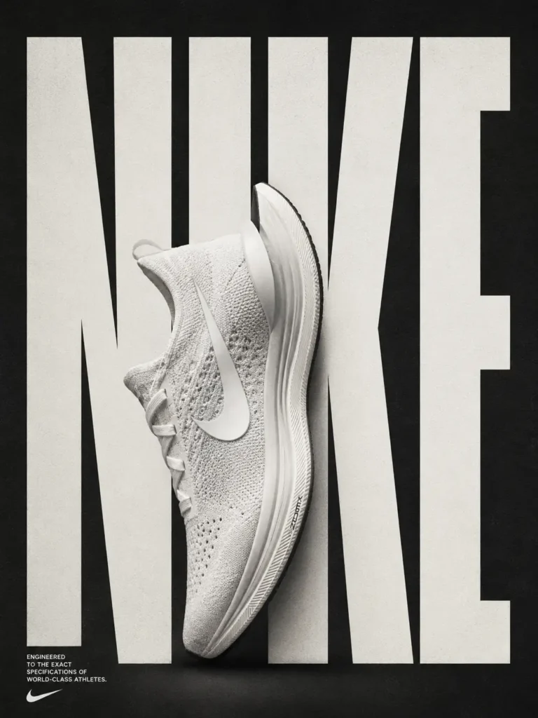
NIKE — Split Sneaker Flat Typography Poster
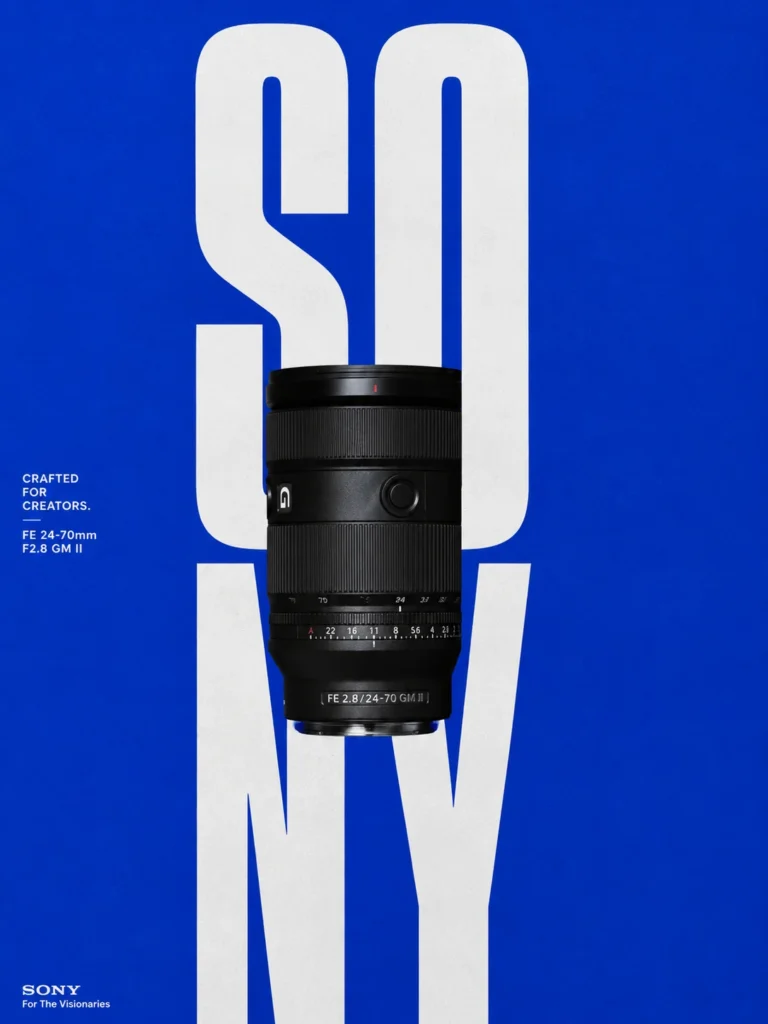
SONY — Camera Lens Typography Fusion Poster
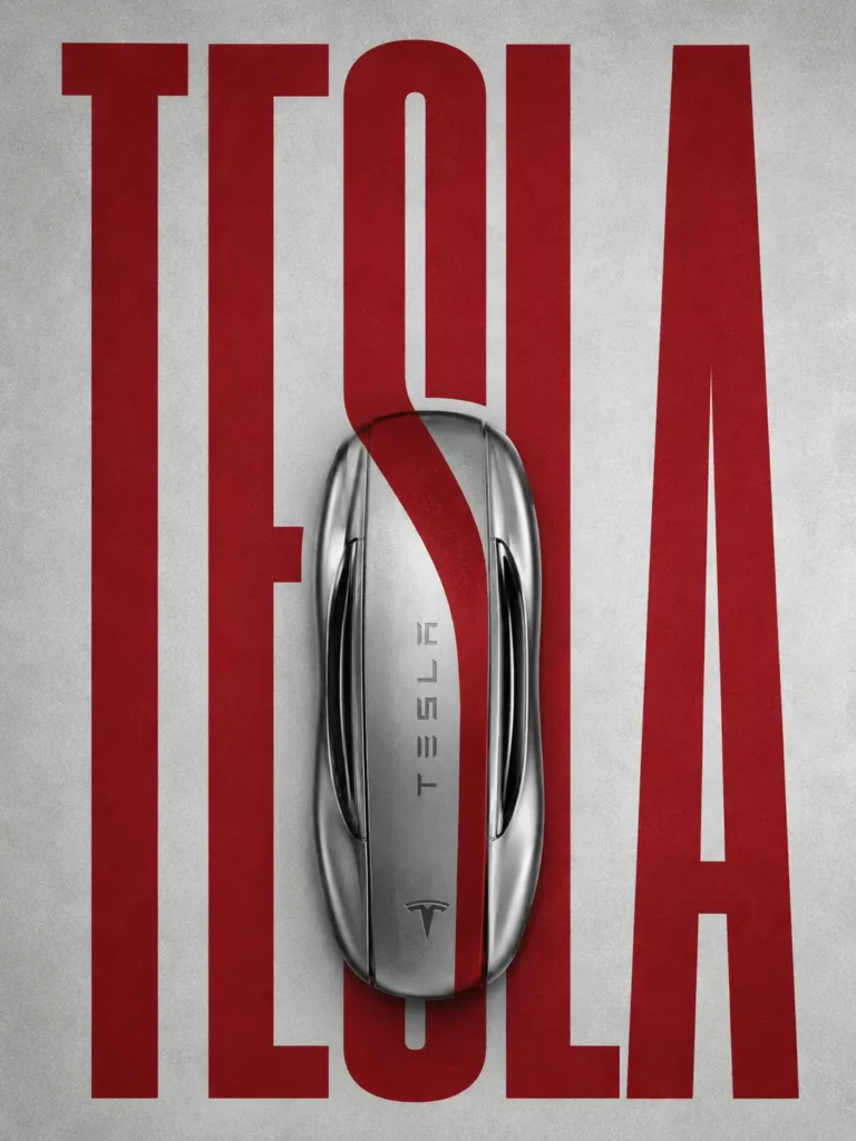
TESLA — Metallic Key Typography Artwork
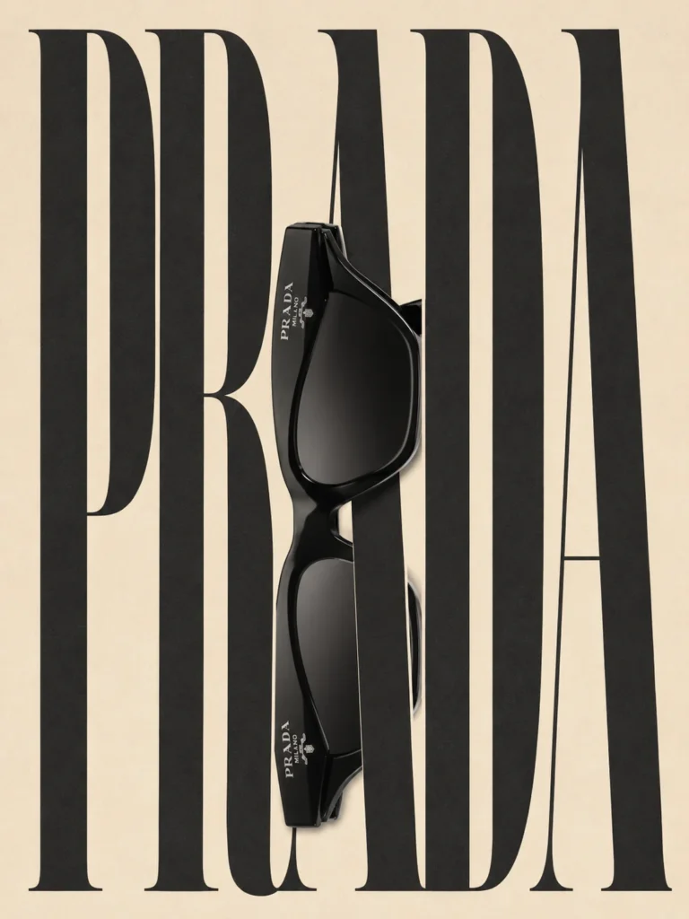
PRADA — Sunglasses Split Typography Poster
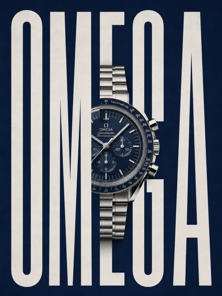
OMEGA — Luxury Watch Typography Integration
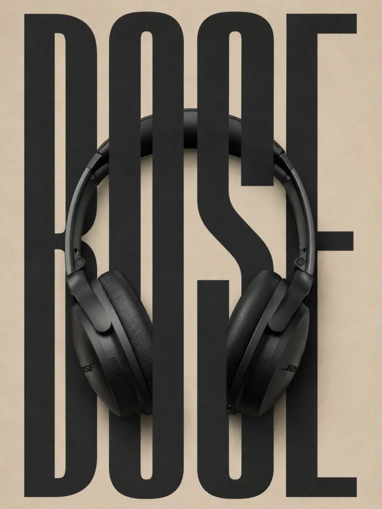
BOSE — Headphone Typography Composition
How to Get More Consistent Results from Split Typography AI Prompts
The six prompts use different products, colours and type styles, but they share the same underlying design problem: the product and the word need to function as one composition.
When adapting these prompts for another product, start with the object itself. A long, narrow product may work with tall lettering, while a wide product may need more horizontal space. A reflective object also needs different lighting instructions from a matte object.
The following adjustments can make a prompt more specific.
Define the Relationship Between the Product and the Letters
Avoid describing only the product and the brand name. Explain what the object should do within the lettering. It might cross the centre of the word, replace part of a letter or interrupt the type while leaving the word readable.
Specify the Typeface Characteristics
Terms such as condensed sans-serif, geometric sans-serif and editorial serif describe different visual structures. Choose the one that suits the product and campaign rather than combining several unrelated styles.
Keep the Background Restrained
A flat background gives the lettering and product a clear visual boundary. Add texture only when it supports the intended finish. Heavy gradients, decorative shapes and unnecessary lighting effects can distract from the central interaction.
Describe the Lighting in Practical Terms
Soft studio lighting, controlled reflections and a grounded shadow describe how the product should appear. These details are more useful than relying entirely on vague instructions such as “make it premium.”
Check the Typography After Generation
Image generators can struggle with exact spelling, letter shapes and spacing. Review the generated result at full size and at thumbnail size. For a campaign-ready design, recreate or correct the lettering in a graphic design application whenever necessary.
This last step is particularly important for brand names. A visually attractive poster is not ready for publication when the wordmark is misspelled or the letters have been distorted.
Where Can You Use This Poster Style?
Split photo flat typography is suitable for several types of visual projects:
- Social media campaigns: Product-led graphics for Instagram, Pinterest and other visual platforms.
- Portfolio projects: Typography experiments for graphic designers and art directors.
- Product launches: Minimal campaign concepts for electronics, fashion accessories and consumer products.
- Brand mood boards: Early-stage visual directions for presenting a campaign concept.
- Editorial layouts: Posters and promotional graphics that combine product imagery with oversized type.
For commercial work, check the relevant brand guidelines and usage permissions before publishing designs featuring real company names, logos or products. An AI-generated concept should not be presented as an official campaign or an endorsed collaboration without authorisation.
Final Thoughts
The strength of split photo flat typography lies in the relationship between two elements that are usually designed separately: the product and the wordmark. When their proportions, placement and contrast work together, the composition can communicate a product identity without relying on a crowded layout.
The six prompts offer different starting points for that process. The sneaker relies on contrast and shape, the camera lens introduces a circular focal point, the sunglasses bring a fashion-editorial character, and the watch depends on fine product detail. The car key and headphones demonstrate how smaller objects can become more prominent through scale and placement.
Use the prompts as a starting framework, then adjust the composition to suit the actual product. The most useful result is not necessarily the one with the most effects. It is the one where the product remains recognisable, the lettering remains readable and every element has a clear reason to be there.More in AI Graphic Design Prompts
This guide is part of our AI Graphic Design Prompts hub, where you’ll find every related guide, along with tips and common questions.

