Dynamic Texture Logos: The New Era of Visual Branding
A flat logo survives reduction because its edges, counters, and spacing remain constant. Introduce chrome, glass, lava, or carbon fiber and those same edges start to soften, thicken, or fill. AI image generators can apply material surfaces in one pass, yet they routinely alter letter geometry, invent highlights that ignore form, or let texture spill past the silhouette. The image may look dense on a large screen and collapse when it becomes a favicon or social avatar.
A dynamic texture treatment is a visual layer applied to an identity. It is not automatically the identity itself. Brands still need a clean vector master, a simplified small-size version, and clear rules about when a textured campaign graphic is appropriate. Confusing surface drama with stronger branding is a common mistake.
What a Dynamic Texture Logo Actually Changes
From flat mark to material surface
Why the original silhouette still matters
Why AI Is Useful for Texture Exploration
Rapid material experimentation
AI shortens the distance between a material idea—brushed metal, frosted glass, molten stone—and a visual test. Multiple directions can be evaluated before committing time to a full 3D render or manual illustration. The prompts that follow are written to push the model toward specific surface behaviors while repeatedly demanding silhouette and proportion preservation.
Where AI interpretation becomes unreliable
Models frequently prioritize visual density over structural accuracy. Reflections may look photographic rather than form-driven. Texture can continue past the logo boundary. Lighting may arrive from conflicting directions. Typography is especially vulnerable: open counters fill, thin strokes thicken, and spacing drifts. These failures are not rare edge cases; they appear regularly enough that inspection after every generation is required.
AI Prompts for Dynamic Texture Logos
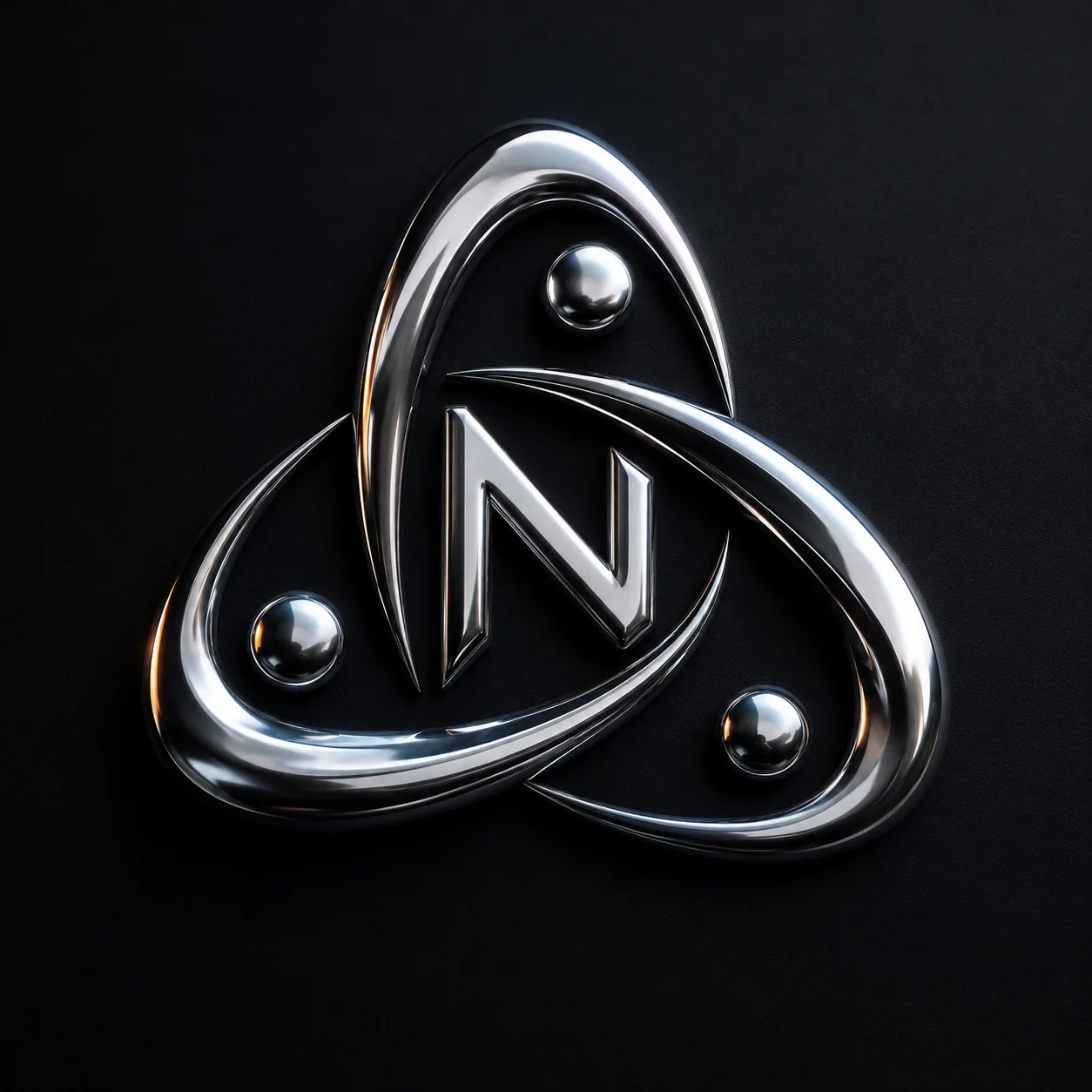
Liquid Chrome Texture Logo
Prompt:
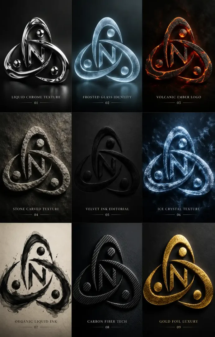
“Transform the uploaded flat logo into a premium dynamic texture logo with flowing liquid chrome metal surfaces wrapping naturally around the original logo structure, preserve exact logo silhouette and proportions, reflective metallic material behavior, cinematic studio lighting, futuristic luxury branding aesthetic, dark matte background, ultra detailed reflections, elegant minimal composition, aspect ratio [AR]”
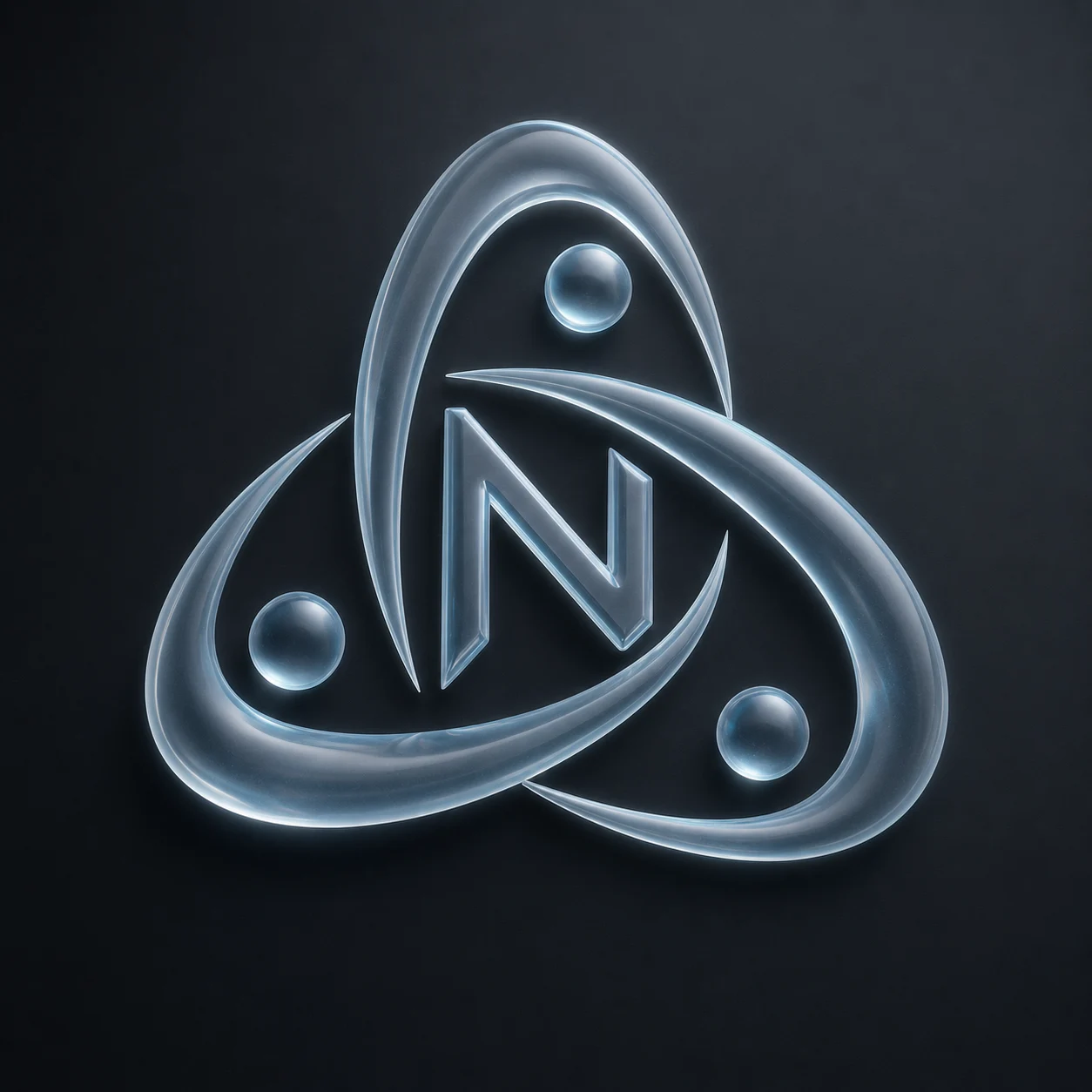
Frosted Glass Identity Logo
Prompt:
“Transform the uploaded flat logo into a futuristic frosted glass texture logo, preserve the original logo shape and typography structure, translucent material behavior, soft edge diffusion, realistic light refraction, minimal luxury composition, subtle reflections, premium technology branding aesthetic, ultra refined material realism, dark modern background, aspect ratio [AR]”
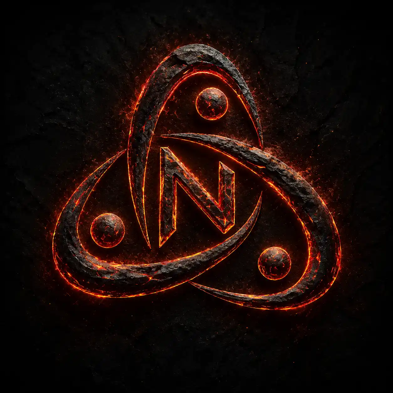
Volcanic Ember Logo
Prompt:
“Transform the uploaded flat logo into a cinematic volcanic ember texture logo with glowing lava cracks and molten surface details integrated naturally inside the original logo structure, preserve logo readability and silhouette, dramatic warm lighting, deep black textures, premium gaming-brand aesthetic, ultra realistic molten material behavior, aspect ratio [AR]”
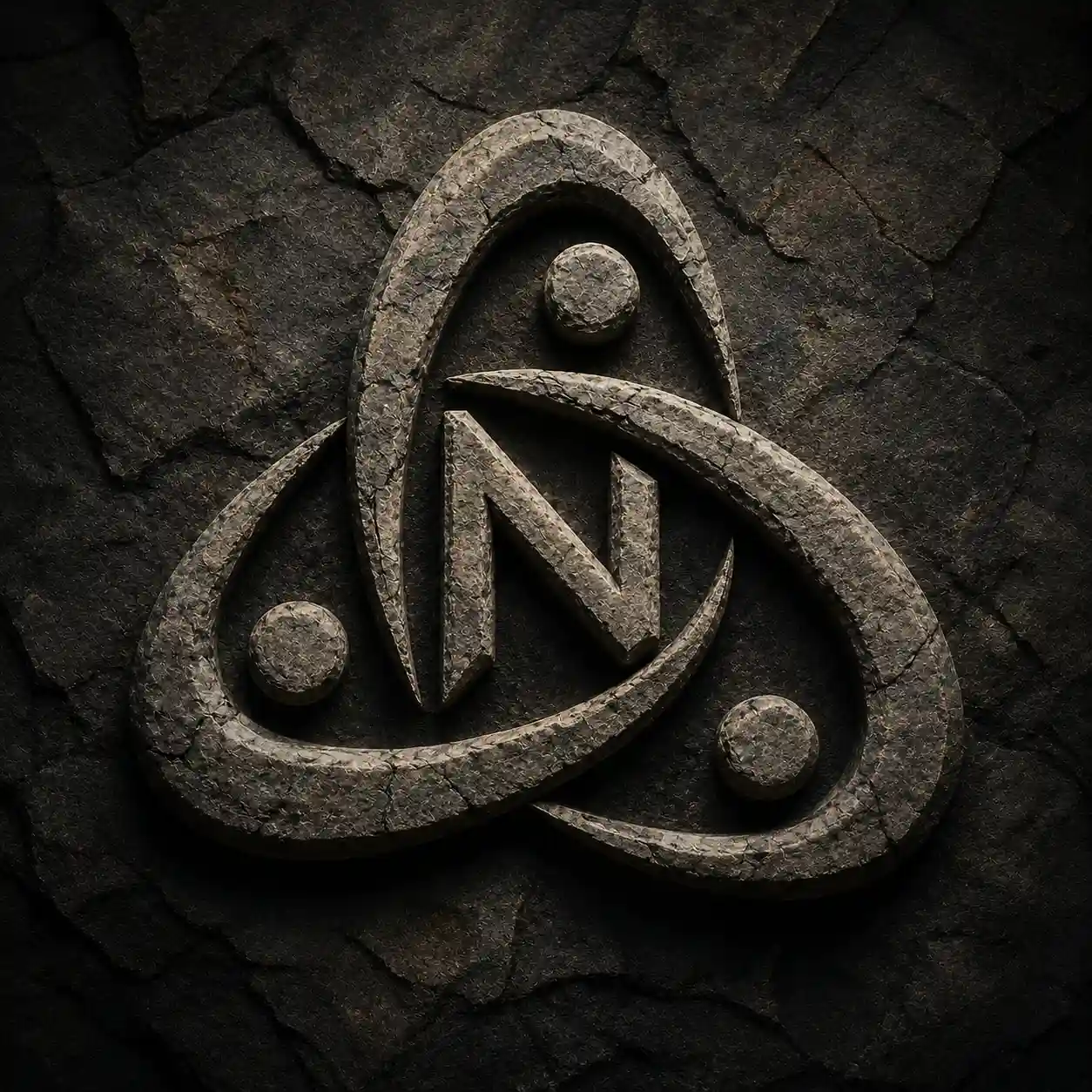
Stone Carved Texture Logo
Prompt:
“Transform the uploaded flat logo into a timeless stone carved texture logo, preserve the exact logo silhouette and proportions, rough natural stone material, realistic erosion, cracked rocky surfaces, dramatic directional shadows, cinematic lighting, premium ancient-meets-modern branding aesthetic, ultra detailed stone realism, aspect ratio [AR]”
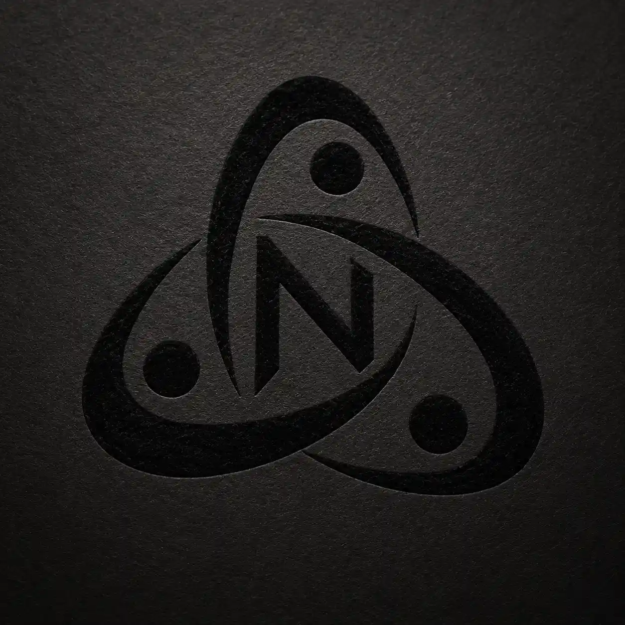
Velvet Ink Editorial Logo
Prompt:
“Transform the uploaded flat logo into an elegant velvet ink editorial logo with deep matte ink textures blended naturally into the original logo structure, preserve typography readability and silhouette, subtle paper grain texture, monochrome luxury fashion aesthetic, premium composition balance, cinematic minimalism, aspect ratio [AR]”
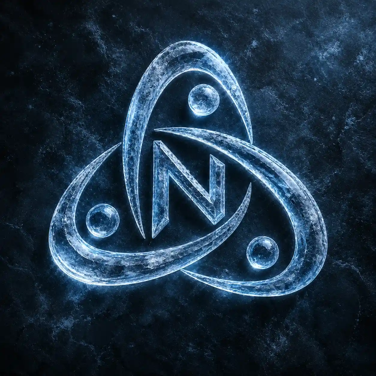
Ice Crystal Texture Logo
Prompt:
“Transform the uploaded flat logo into a frozen crystal texture logo with realistic ice surfaces, translucent frosted edges, sharp crystalline reflections, cinematic cold lighting, preserve original logo structure and readability, premium winter-brand aesthetic, ultra detailed material realism, aspect ratio [AR]”
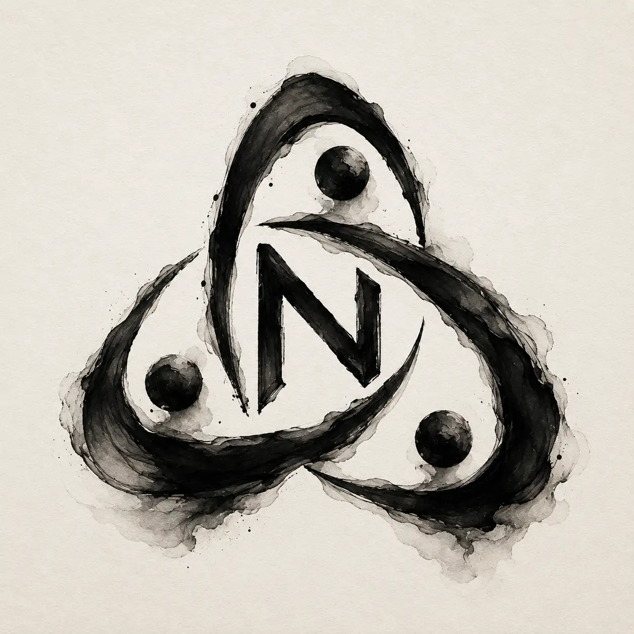
Organic Liquid Ink Logo
Prompt:
“Transform the uploaded flat logo into an artistic organic liquid ink texture logo formed through flowing black ink motion, preserve the original logo silhouette and typography structure, elegant fluid behavior, subtle paper texture background, refined contrast control, premium abstract branding aesthetic, aspect ratio [AR]”
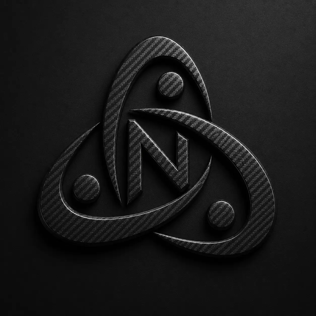
Carbon Fiber Tech Logo
Prompt:
“Transform the uploaded flat logo into a modern carbon fiber technology logo, preserve the original logo shape and typography proportions, integrate realistic carbon fiber surface textures, matte black material behavior, subtle industrial reflections, luxury automotive-tech branding aesthetic, ultra clean futuristic composition, aspect ratio [AR]”
Gold Foil Luxury Logo
Prompt:
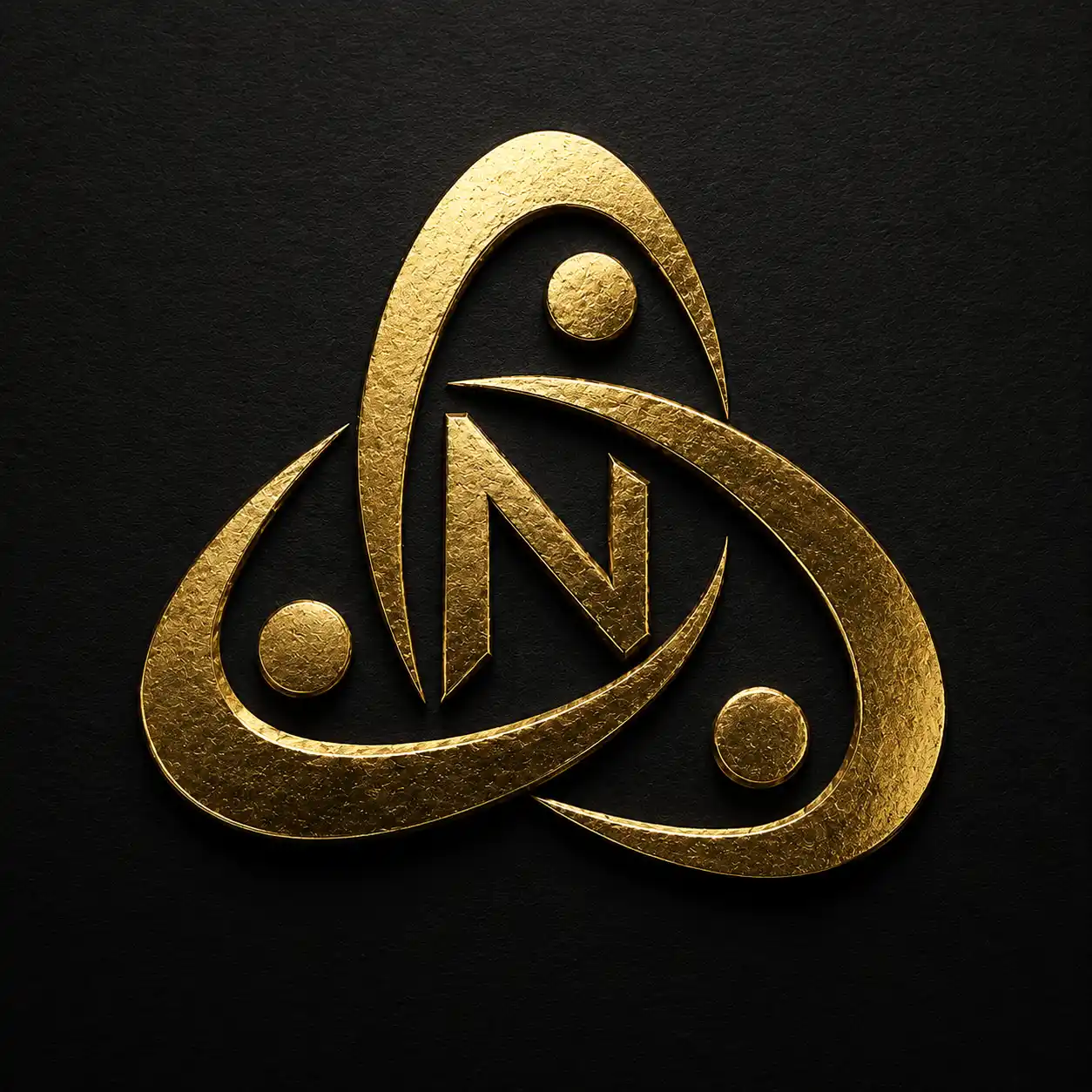
“Transform the uploaded flat logo into a high-end gold foil luxury logo, preserve the original logo silhouette and typography structure, embossed metallic gold texture with realistic shine, premium black background, subtle paper grain detail, cinematic luxury lighting, refined minimal composition, ultra realistic branding presentation, aspect ratio [AR]”
What Can Go Wrong With AI Logo Transformations
Typography distortion
AI frequently alters counters, stroke weight, and spacing even when the overall silhouette looks intact. Open letters such as a, e, or o are especially vulnerable. Side-by-side comparison at 100% scale reveals these shifts quickly.
Broken negative space
Texture that fills or softens the spaces between forms reduces recognition. Negative space is part of the logo’s structure; when it is compromised, the mark becomes harder to parse at a glance.
Unrealistic material behavior
Reflections that ignore geometry, cracks that ignore form, or patterns that ignore orientation produce surfaces that look applied rather than inherent. Lighting from multiple inconsistent directions compounds the problem.
Too much visual detail
High-frequency texture that reads as rich at presentation size turns into noise when reduced. Fine cracks merge, glass edges become muddy, and carbon-fiber patterns turn into grain. Small-size testing is not optional.
How to Check an AI-Generated Logo Before Using It
Compare it with the original
Place the generated image and the vector side by side at identical scale. Examine counters, corner radii, inter-letter spacing, and overall proportions. Any drift that is visible at this stage will become more obvious in application.
Test readability at small sizes
Reduce the image to favicon, avatar, and mobile-header sizes. Texture that survives large formats often fails here because high-frequency detail collapses into mud or noise.
Inspect lighting and material consistency
Confirm that highlights describe form rather than sit as flat overlays. Check that texture stops at the logo boundary and that lighting direction is coherent across the entire mark.
Where Dynamic Texture Logos Actually Work
Campaign graphics
Large-format campaign images can support higher surface complexity because viewing distance and scale allow finer details to remain visible without overwhelming the composition.
Website hero visuals
Hero treatments benefit from depth and material interest without needing to function as the permanent site identity. This makes them a safer place to experiment with visual effects.
Social media
Key visual posts and launch assets can use textured versions, while profile avatars and repeating icons usually need a cleaner treatment that remains recognizable at small sizes.
Presentations and launch artwork
Presentation slides and launch decks can tolerate richer materials because the context is temporary and controlled. Effects can be pushed further without imposing them on every brand touchpoint.
Final Practical Takeaway
Start with a clean source logo. Select a material that matches brand character rather than visual novelty. Apply the relevant prompt. Inspect the result against the original for geometry, negative space, and lighting logic. Test at multiple scales. Regenerate when structural errors are severe; retouch when the concept is strong but small defects remain. Keep the original vector available for everyday brand use.
Material realism does not automatically produce better branding. A dynamic texture treatment succeeds when it supports the logo’s recognizable structure rather than competing with it. The safest and most useful approach treats texture as a controlled visual layer applied for specific moments, while the underlying identity system remains stable, scalable, and clear.