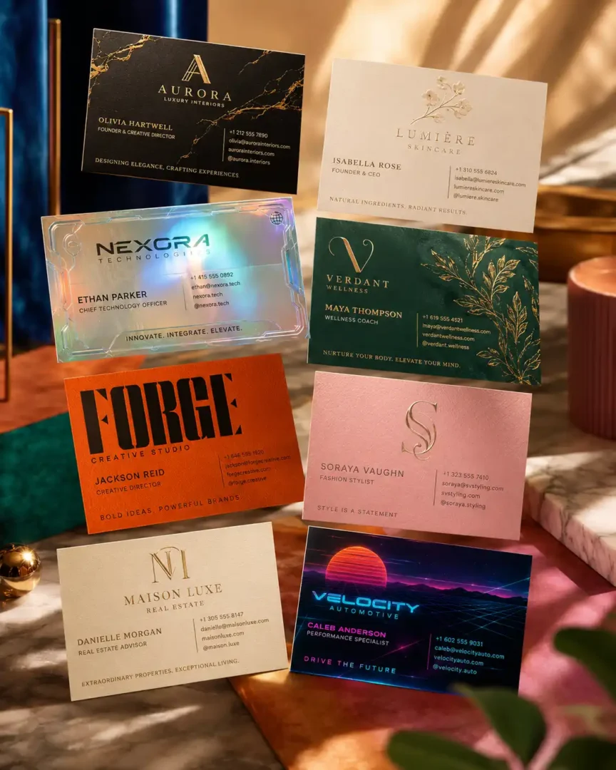
How to Create Luxury Business Cards With AI: 10 Prompts to Try
A business card has a small canvas, which is exactly why bad design becomes obvious so quickly.
There is nowhere to hide a weak hierarchy. If the company name is too small, the contact details compete with the logo, or the background is doing more work than the information, the card starts looking like a mockup rather than a real piece of branding.
That is where I find Business Cards AI prompts useful.
I don’t use an AI prompt simply to ask for a “beautiful luxury business card.” That usually gives you the same collection of words: black background, gold foil, elegant typography, dramatic lighting.
Instead, the prompt needs to make decisions.
What should people notice first?
Where should the empty space remain?
Should the material feel like paper, metal, glass or marble?
Is the design supposed to feel expensive, technical, artistic or understated?
And, perhaps most importantly, will there still be enough room to add the actual business information afterward?
That last point is easy to overlook. AI can produce a convincing card image while getting the small details wrong. Names, phone numbers, email addresses and other fine typography should be checked carefully rather than trusted just because the preview looks polished.
So the prompts below are best treated as creative starting points. Generate the visual direction first, choose the strongest concept, then clean up the typography and print specifications in your normal design workflow.
Before You Copy the Prompts
Replace the information inside the brackets with your own details:
- [NAME]
- [JOB TITLE]
- [COMPANY]
- [PHONE]
- [EMAIL]
- [WEBSITE]
- [ADDRESS]
- [SOCIAL HANDLE]
- [TAGLINE]
- [AR]
There is another useful trick here: don’t change the source information while comparing styles.
Use the same name, company and role across several generations. That makes the comparison much more useful because you are judging the design direction rather than accidentally comparing different content.
Business Cards AI Prompts
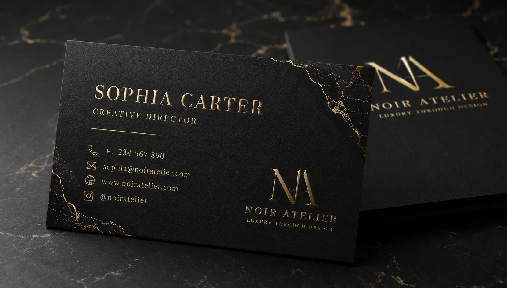
Royal Black & Gold Luxury Card
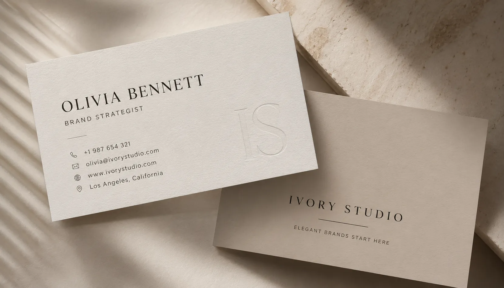
Minimal Editorial Business Card
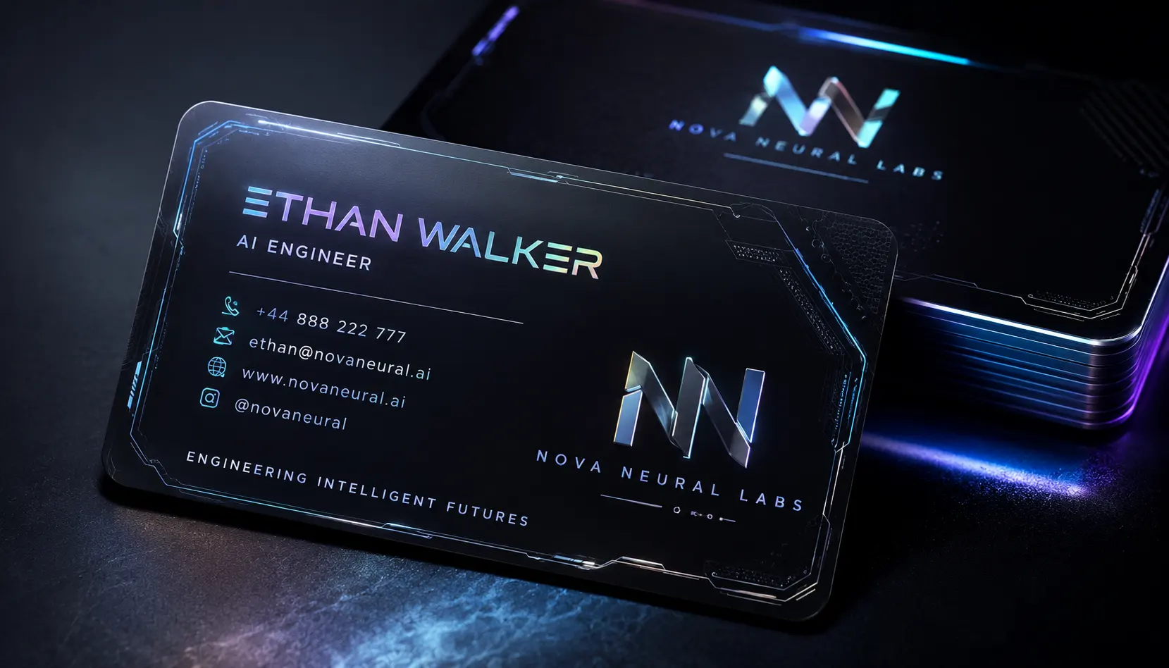
Futuristic Tech Business Card
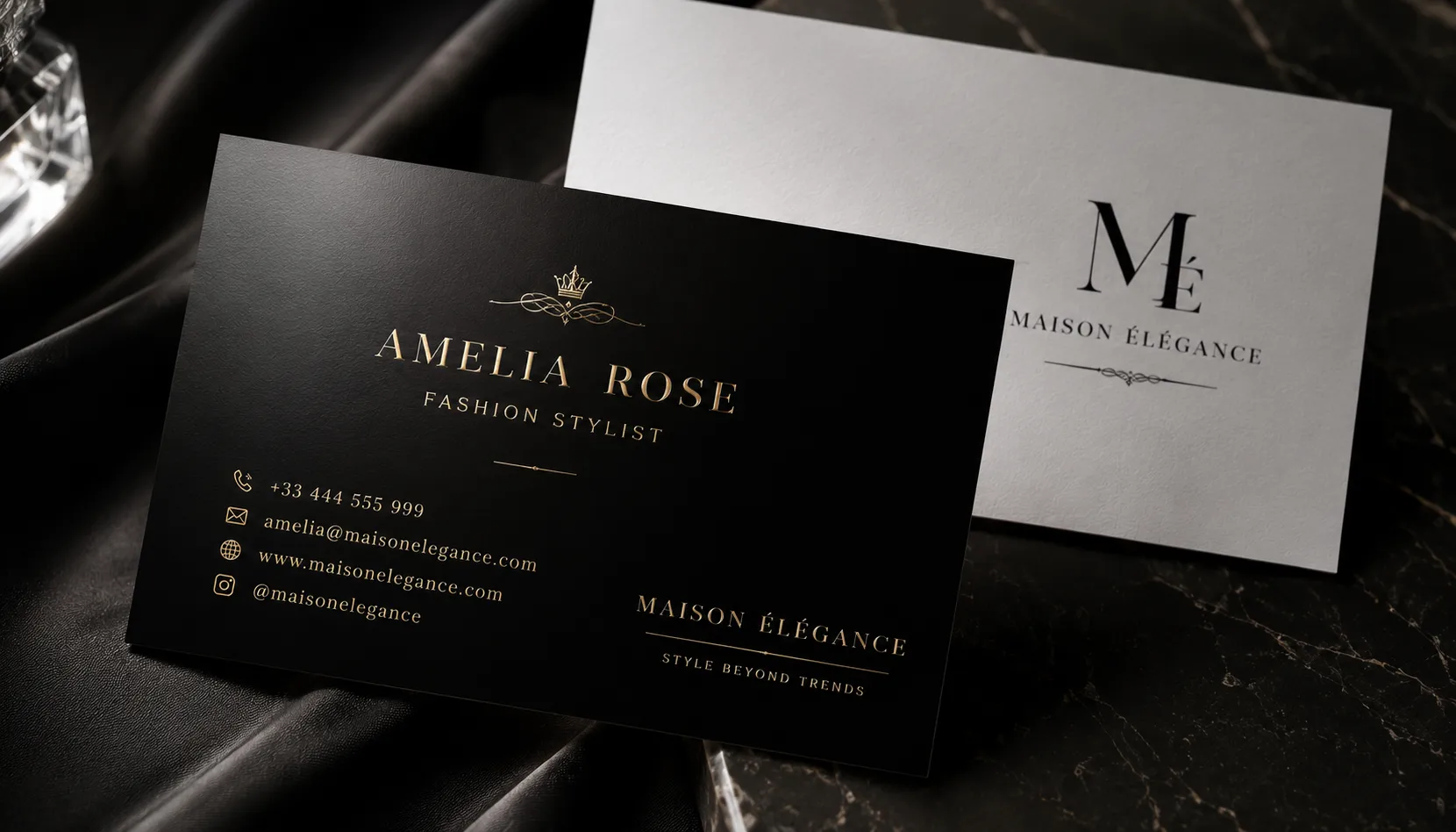
Couture Fashion Business Card
Creative Agency Identity Card
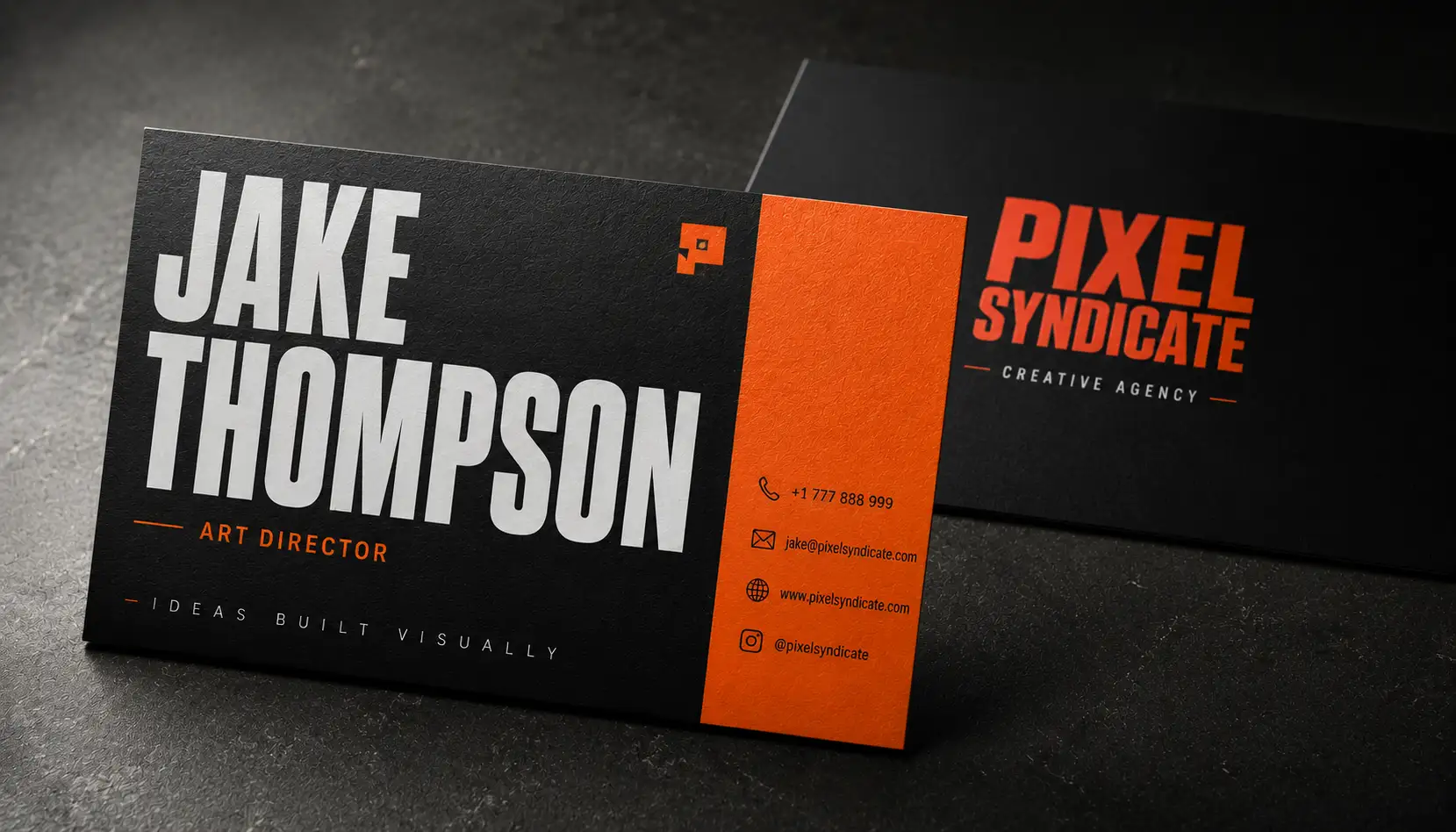
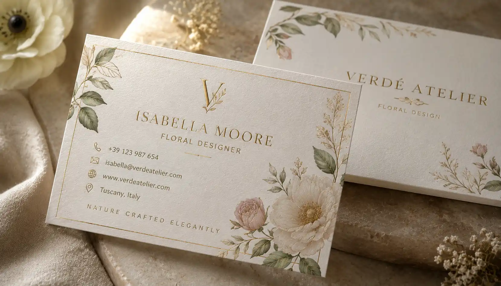
Botanical Luxury Business Card
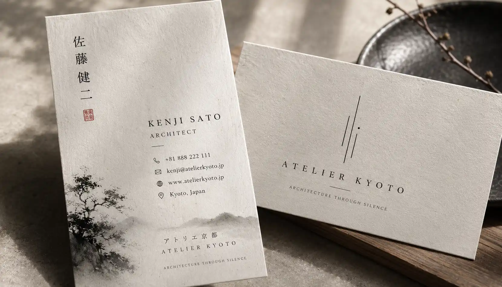
Japanese Zen Minimal Business Card
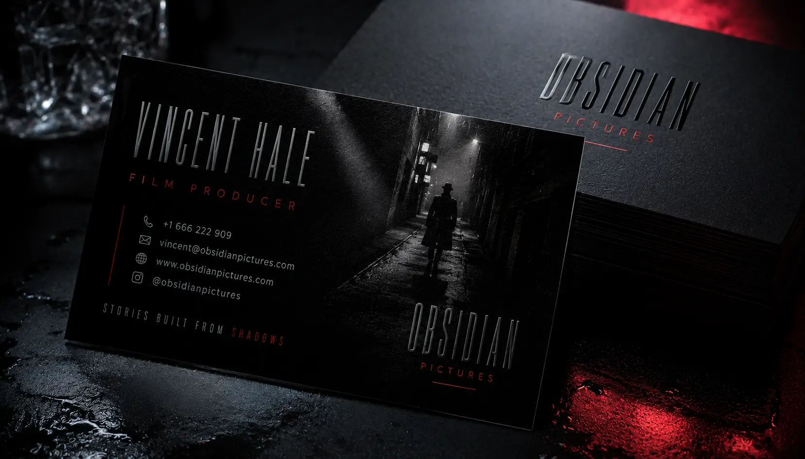
Dark Neo-Noir Business Card
Futuristic Glassmorphism Business Card
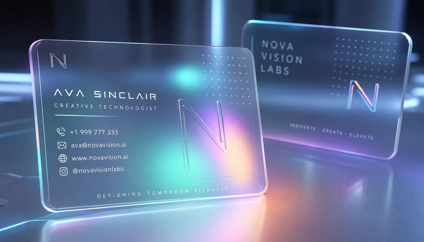
Which Business Cards AI Style Fits Your Brand?
| Style | What it communicates | Good starting photo |
|---|---|---|
| Royal Black & Gold | Established, exclusive | Close-up portrait |
| Minimal Editorial | Calm, sophisticated | Clean portrait |
| Futuristic Tech | Innovation, technology | Dramatic portrait |
| Couture Fashion | Artistic, high-end | Editorial portrait |
| Creative Agency | Experimental, energetic | Characterful portrait |
| Botanical Luxury | Natural, handcrafted | Soft portrait |
| Japanese Zen | Quiet, considered | Simple portrait |
| Neo-Noir | Cinematic, mysterious | Moody portrait |
| Glassmorphism | Digital, futuristic | Modern portrait |
| Brutalist | Bold, unconventional | Strong portrait |
| Emerald Marble | Wealth, jewellery, luxury | Elegant portrait |
| Retro Futurism | Nostalgic, creative | Stylised portrait |
The useful part of this comparison is not choosing the style that looks most impressive in a single AI preview.
Choose the one that still makes sense when the person’s name, job title and contact information are placed on the card.
A spectacular background can actually make a poor business card.
What I Would Do After Generating the First Version
Don’t immediately start changing the entire prompt.
Look at the result and identify one failure at a time.
If the material looks right but the layout is crowded, fix the layout.
If the layout works but the name is difficult to read, fix the typography area.
If the card looks good but the logo has changed, correct the logo separately.
If the concept is strong but the generated contact details are wrong, don’t waste ten generations trying to make tiny text perfect. Move the final typography into your design software.
That workflow matters because AI is particularly useful for visual exploration—textures, composition, materials and overall art direction—but production typography still deserves a deliberate review.
A Simple Business Cards AI Workflow
Start with the visual direction
Choose two or three prompts rather than generating all twelve immediately.
For example, a jewellery brand might compare:
- Emerald Marble
- Black & Gold
- Minimal Editorial
The comparison will tell you more than generating twelve unrelated styles.
Keep the information consistent
Use the same:
- name
- company
- job title
- logo
- contact details
across the variations.
That gives you a fair visual comparison.
Judge the card without the mockup
An angled card sitting on a marble desk can make almost anything look expensive.
For design evaluation, a flat, straight-on view is more useful because you can actually judge proportion, spacing and hierarchy.
Add final typography carefully
If the generated text is incorrect, don’t consider the whole concept a failure.
The visual direction may still be excellent.
Use the AI output as the artwork or design reference, then recreate the important type accurately.
This is especially important for:
- names
- phone numbers
- email addresses
- websites
- addresses
- QR codes
- legal information
Business Cards AI: What Usually Goes Wrong?
The card looks impressive but isn’t usable
This usually happens when the prompt prioritizes atmosphere over hierarchy.
A business card has a job: someone should be able to identify the person or company quickly.
The AI makes the card too busy
Ask for controlled negative space rather than simply asking for a luxury design.
A quiet area gives the final typography somewhere to breathe.
The contact information is wrong
Treat generated contact information as something that needs checking. AI-generated images can produce convincing-looking text that is nevertheless incorrect.
The proportions feel strange
State the intended card format or aspect ratio clearly. AI often prefers attractive presentation shots, which can distort the actual proportions of the card.
The “luxury” effect looks fake
This is often caused by stacking too many luxury signals together:
gold + marble + chrome + black + dramatic lighting + embossed type + jewellery + reflections
More luxury vocabulary does not automatically produce better branding.
Sometimes one material and one strong typographic decision are enough.
Can You Use These Business Cards AI Prompts With ChatGPT?
Yes. You can use the prompts as starting points with ChatGPT’s image generation, as well as other image-generation platforms.
The important distinction is between generating the concept and finishing the business card.
For a real card, I would generate several visual directions first, choose one, then refine the actual typography, logo placement, dimensions and print setup separately.
That gives you much more control than asking the image model to solve every part of the card at once.
Frequently Asked Questions
What are Business Cards AI prompts?
Business Cards AI prompts are detailed instructions used with image-generation tools to explore business card layouts, materials, typography direction, colour combinations and branding styles.
Can AI create a complete business card?
It can create a convincing visual concept, but you should still check the typography, logo, dimensions and contact information before treating the result as a finished card. Small text is an area where image-generation workflows can still require additional work.
Which style should I try first?
Start with the style that matches the brand rather than the one that looks most dramatic.
For a consultant, try Minimal Editorial. For a jewellery brand, Emerald Marble or Black & Gold may make more sense. For a technology company, compare Futuristic Tech with a much quieter minimalist option.
Can I use my own name and company in the prompts?
Yes. Replace the bracketed information with your actual details. Keep the information identical when comparing different visual styles.
Why does AI sometimes produce the wrong phone number or email?
Image generators may interpret small typography visually rather than treating every character as editable business information. That’s why important contact details should be checked and, when necessary, added separately in a design application.
Should I put my logo directly into the AI prompt?
You can experiment with it, but don’t assume the generated logo will remain accurate. If the logo is an important brand asset, treat the AI output as a concept and place the original logo during the finishing stage.
Are these designs ready to send directly to a printer?
Not automatically.
Before printing, check the final dimensions, bleed, safe area, resolution, colour setup, typography and logo quality. AI-generated artwork is better treated as a starting visual asset unless it has been properly prepared for the printer’s specifications.
Which AI tool is best for business card designs?
There isn’t one universal answer. Different tools have different strengths. For this type of work, I would choose based on whether you need strong image composition, accurate typography, reference-image control or a clean workflow into your design software.
Can one prompt work for every business?
Not really.
A business card for a luxury jeweller has a different communication problem from one for an AI engineer or a photographer. The best prompt reflects the brand’s actual personality, not just the visual trend you happen to like.
The Better Way to Think About AI Business Cards
The interesting shift isn’t that AI can suddenly “design business cards.”
Designers could already make business cards.
The useful change is that AI makes it cheap to explore directions that might otherwise take hours to mock up.
You can ask:
What if this brand felt quieter?
What if the same identity used paper instead of chrome?
What would the card look like if the typography became the main visual element?
Those experiments are where these prompts become genuinely useful.
The goal isn’t to make a business card that screams AI-generated luxury.
The goal is to find a visual direction that makes sense for the business—and then have enough human control left to turn that direction into an actual, readable card.