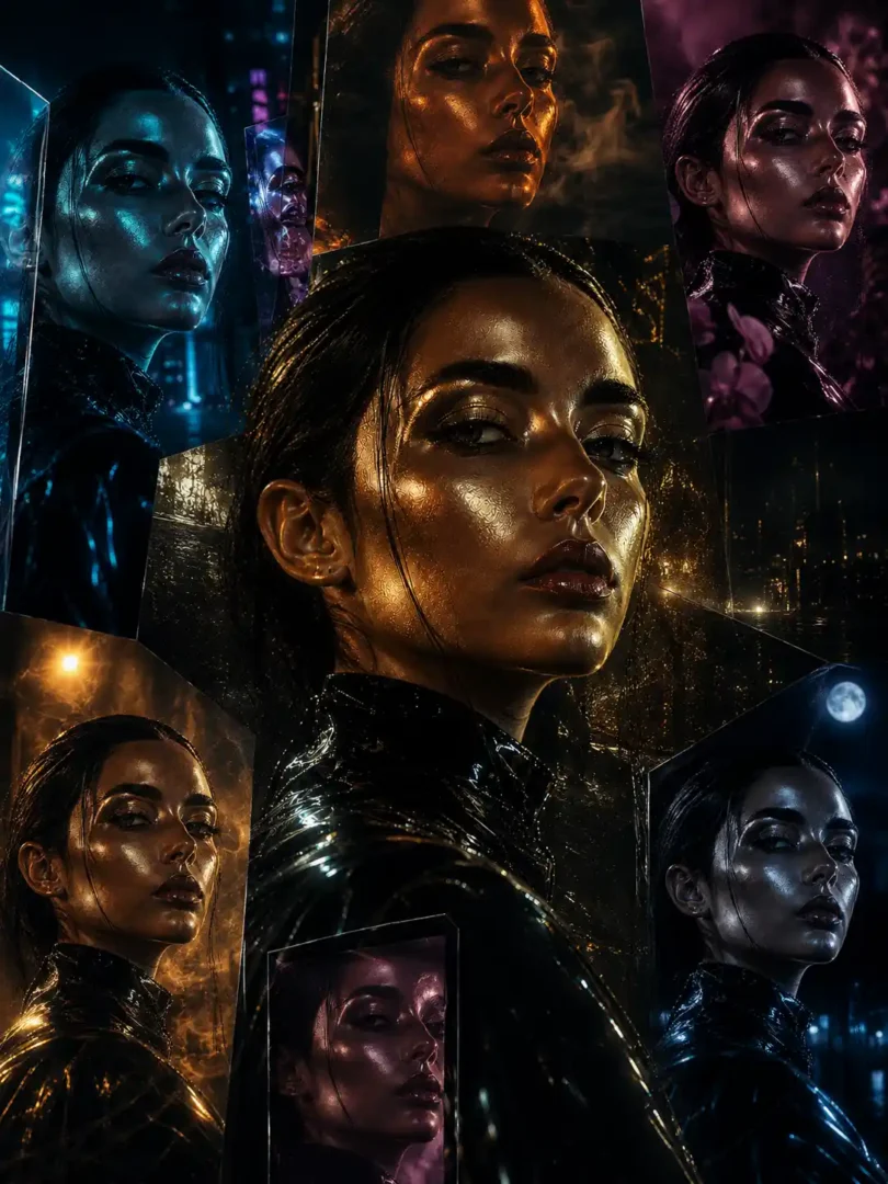
AI Color Grading Ideas for Luxury Portraits – Viral AI Prompts
Most AI portraits still look like they came from the same color pipeline. Skin sits in a safe mid-tone, shadows fall into generic teal or magenta, and the whole frame carries that slightly over-sharpened, evenly lit glow that signals “generated.” The difference between those and the ones that stop a scroll is rarely more detail. It’s color grading that behaves like a deliberate lighting and material decision instead of a post-process LUT.
Creators working in Flux, Midjourney, Leonardo, and similar tools have started treating the color grade as part of the prompt architecture rather than something applied later. The goal is not a prettier filter. It is to force the model to build skin response, shadow temperature, atmospheric density, and specular behavior around a specific emotional register—sci-fi chrome, volcanic heat, frozen neon, orchid dusk—from the first generation. When the grade is written into the prompt, the lighting and texture usually follow. When it is left to defaults, the image stays generic no matter how many “ultra detailed” phrases you add.
AI Color Grading Ideas for Luxury Portraits – Viral AI Prompts
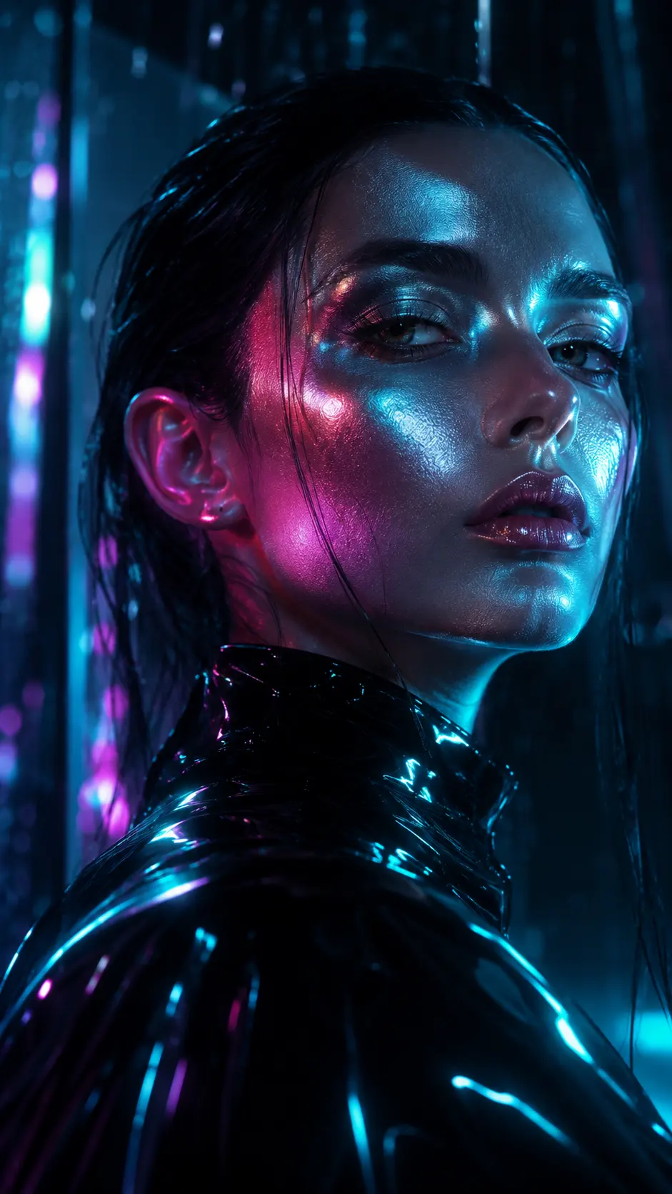
Liquid Chrome Pulse Color Grading
Prompt:
“Create a hyper-realistic cinematic portrait from [uploaded image] with Liquid Chrome Pulse color grading, reflective silver skin highlights, deep graphite shadows, holographic cyan-magenta glow, futuristic wet-light reflections, ultra detailed skin texture, luxury sci-fi editorial atmosphere, dramatic contrast, cinematic depth, unreal premium color science” (AR: 9:16)
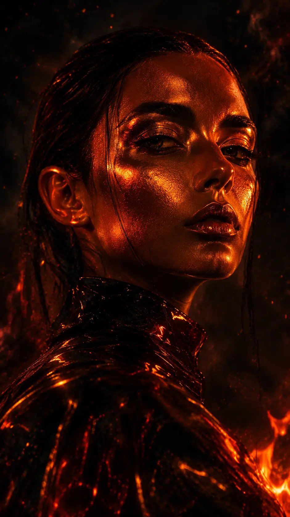
Volcanic Ember Skin Color Grading
Prompt:
“Create a cinematic human portrait from [uploaded image] with Volcanic Ember Skin color grading, glowing lava-orange skin reflections, smoky charcoal shadows, burnt crimson undertones, atmospheric ash diffusion, ultra realistic facial texture, primal cinematic energy, dark fantasy editorial photography style” (AR: 9:16)
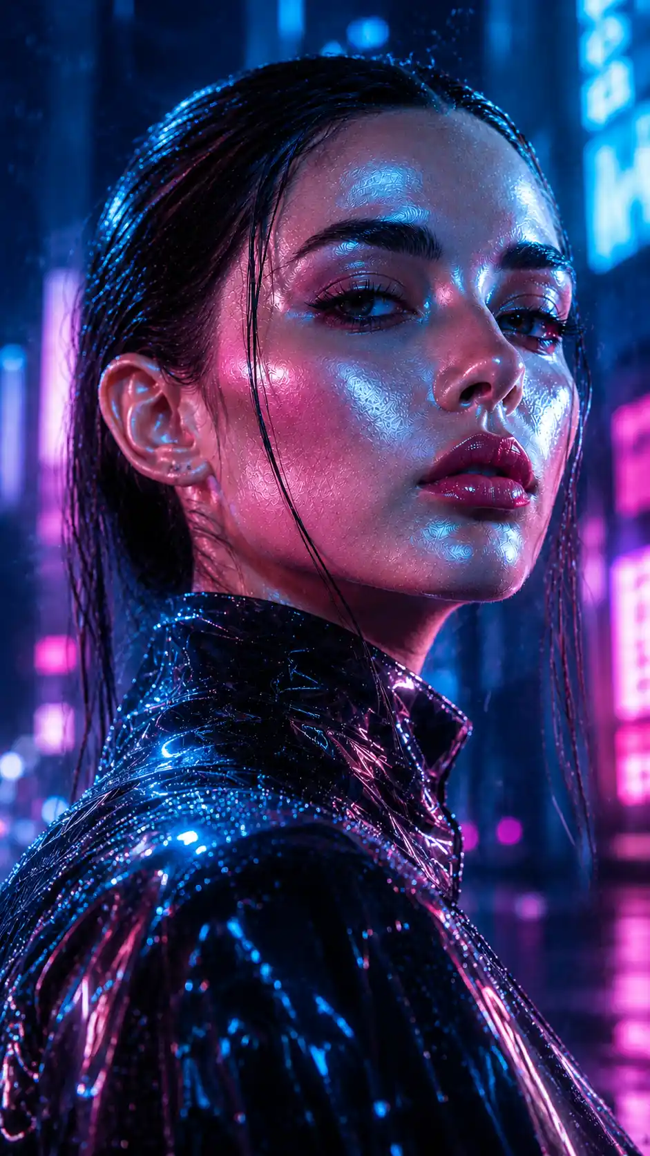
Frozen Neon Bloom Color Grading
Prompt:
“Create a futuristic portrait from [uploaded image] with Frozen Neon Bloom color grading, icy blue highlights melting into vibrant pink neon shadows, translucent skin glow, cyberpunk atmosphere, cold cinematic lighting, ultra detailed eyes, luxury futuristic fashion campaign aesthetic” (AR: 9:16)
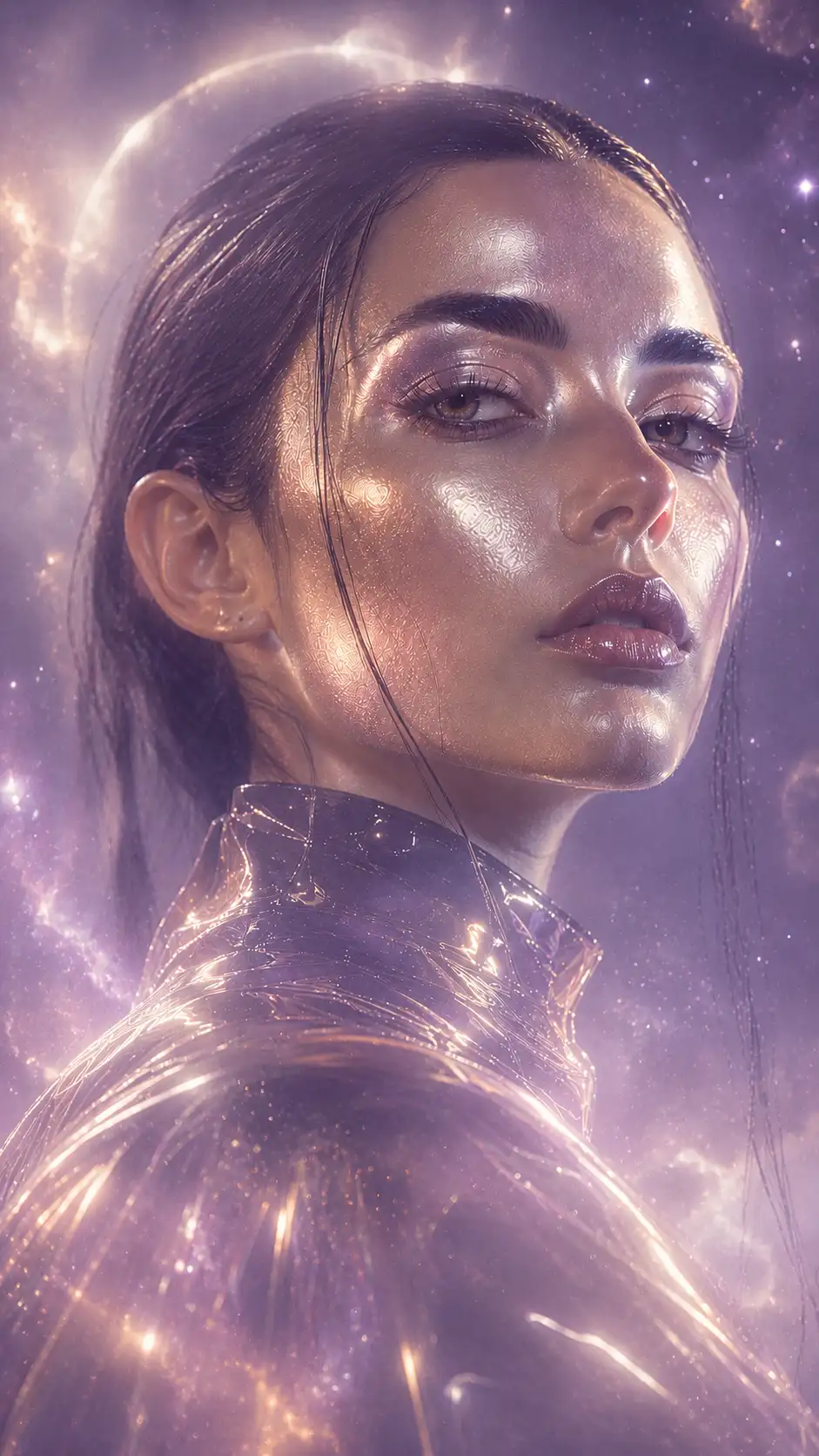
Celestial Dust Fade Color Grading
Prompt:
“Create an ethereal portrait from [uploaded image] with Celestial Dust Fade color grading, soft cosmic lavender haze, champagne-gold skin glow, dreamy atmospheric diffusion, subtle galaxy-inspired shadows, cinematic fine-art realism, heavenly editorial lighting, ultra premium portrait photography” (AR: 9:16)
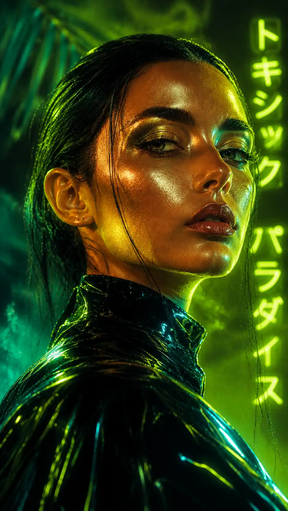
Toxic Paradise Color Grading
Prompt:
“Create a bold cinematic portrait from [uploaded image] with Toxic Paradise color grading, radioactive lime-green highlights, deep tropical teal shadows, surreal warm skin tones, humid neon atmosphere, high-fashion dystopian editorial aesthetic, ultra sharp facial details” (AR: 9:16)
Royal Obsidian Glow Color Grading
Prompt:
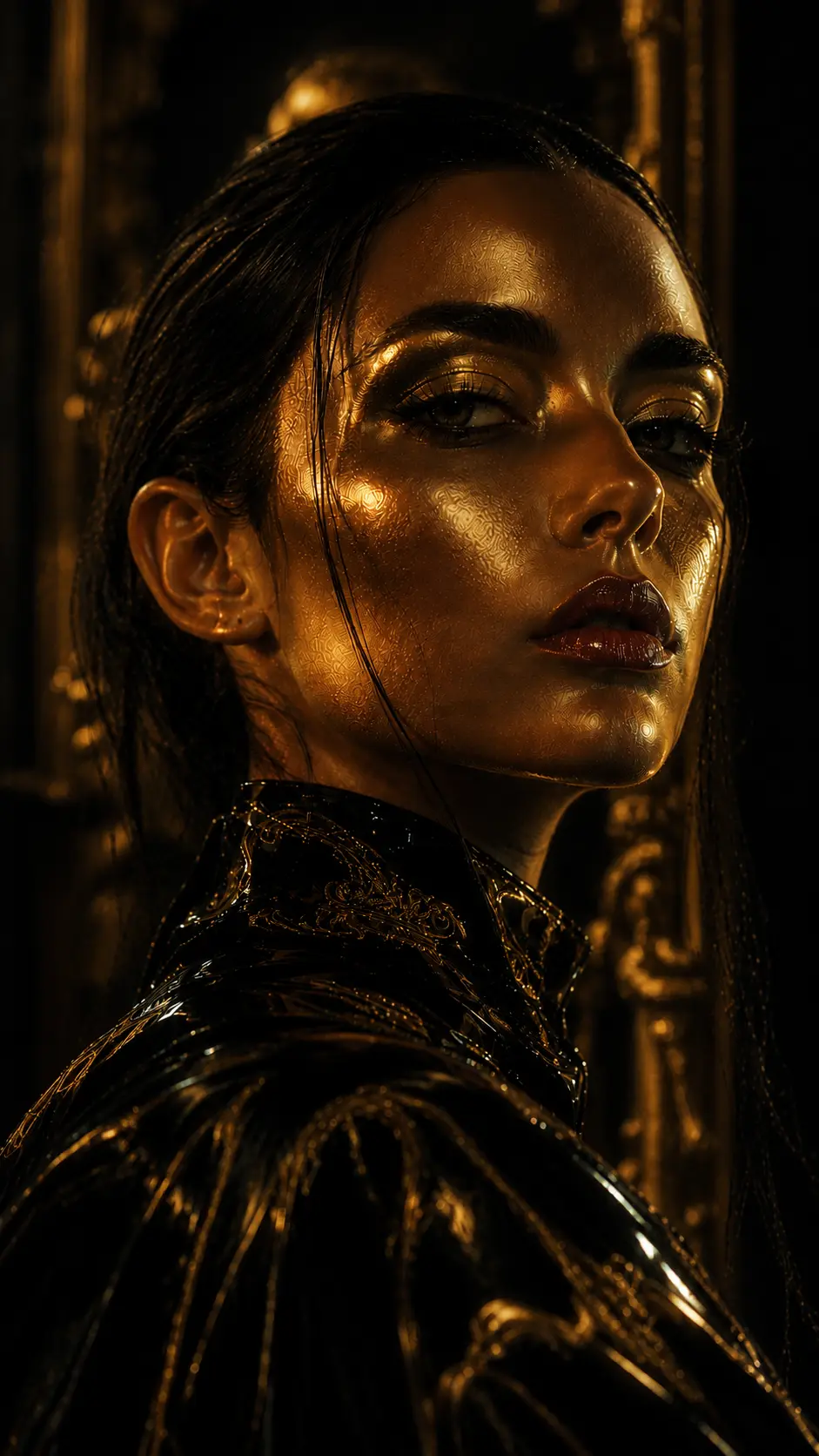
“Create a luxury portrait from [uploaded image] with Royal Obsidian Glow color grading, rich obsidian-black shadows, royal gold highlights, velvet skin texture, dramatic cinematic contrast, museum-grade editorial lighting, ultra realistic premium fashion photography” (AR: 9:16)
Moonlit Sapphire Skin Color Grading
Prompt:
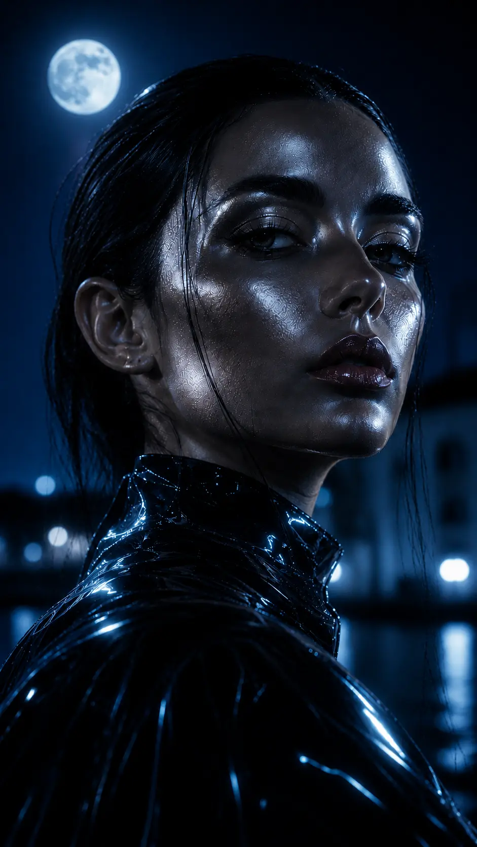
“Create a cinematic night portrait from [uploaded image] with Moonlit Sapphire Skin color grading, deep sapphire-blue shadows, soft moonlight silver reflections, cold atmospheric depth, elegant skin luminosity, mysterious luxury aesthetic, ultra realistic nighttime editorial photography” (AR: 9:16)
Solar Mirage Tone Color Grading
Prompt:
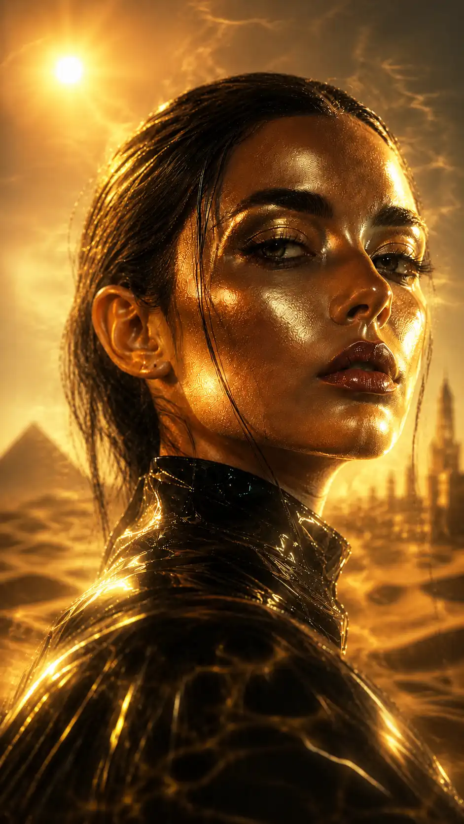
“Create a surreal cinematic portrait from [uploaded image] with Solar Mirage Tone color grading, blazing desert-gold highlights, shimmering heatwave distortion, warm bronze skin glow, dusty amber shadows, dreamlike atmospheric realism, luxury cinematic travel editorial style” (AR: 9:16)
Phantom Orchid Cinema Color Grading
Prompt:
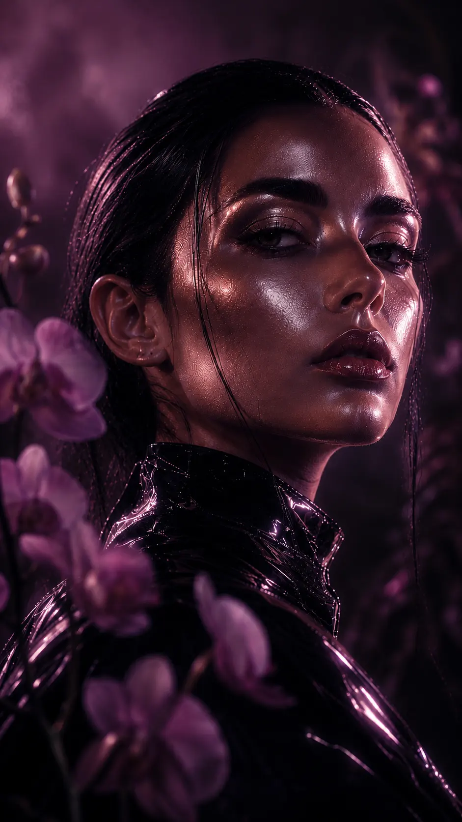
“Create an ultra-premium portrait from [uploaded image] with Phantom Orchid Cinema color grading, deep orchid-purple shadows, soft pink luminous highlights, mysterious cinematic haze, elegant skin reflections, dark romantic fashion editorial atmosphere, ultra realistic facial texture and lighting” (AR: 9:16)
How to create your own AI color grading prompts
The useful part of these grades isn’t actually the names.
You can invent your own.
Start with four decisions:
What color owns the highlights?
Silver, gold, orange, pink, green and blue will all change the perceived character of the portrait.
What happens in the shadows?
This is where many prompts become vague. Instead of simply saying “dark shadows,” decide whether those shadows are graphite, sapphire, charcoal, crimson, violet or amber.
How should the skin respond?
Skin can stay warm, become reflective, pick up surrounding color, remain neutral, or carry a subtle glow.
What happens to the atmosphere?
Fog, haze, dust, humidity, smoke, reflections and heat distortion can make a grade feel like part of the scene rather than something laid over it.
Put those four decisions together and you have something far more useful than a generic instruction to “make it cinematic.”
Why “ultra detailed” doesn’t fix a generic AI portrait
This is probably the most common mistake in AI portrait prompting.
A prompt gets longer and longer:
“8K, ultra detailed, hyper realistic, highly detailed skin, cinematic, professional photography, sharp focus…”
The result gets more polished, but not necessarily more distinctive.
There is a reason.
Detail and direction are different things.
“Ultra detailed skin texture” can tell the model to pay attention to the skin. It does not tell the model whether that skin should catch silver light, absorb warm orange reflections, sit against cold blue shadows or remain relatively neutral.
Color language can supply that missing direction.
A reflective silver highlight describes how light behaves.
A graphite shadow describes the darker tonal environment.
A champagne glow changes the relationship between skin and surrounding light.
Those are actual visual decisions.
Once those decisions exist, detail becomes useful. Without them, adding more detail can simply produce a sharper version of an image that was generic in the first place.
Keep the portrait and change the visual language
Another useful way to work with these prompts is to separate the subject from the grade.
Keep the reference portrait and the core color direction intact.
Then change the surrounding elements:
- wardrobe
- background
- expression
- environment
- camera framing
- composition
- aspect ratio
A single portrait can therefore move between several visual treatments without rebuilding the entire prompt from zero.
The same face could become a chrome fashion campaign, a volcanic editorial, a moonlit beauty image or a black-and-gold luxury portrait.
The subject changes.
The visual language changes.
But the underlying prompt structure stays manageable.
For different publishing formats, the same principle applies. If the portrait needs to move from a vertical social composition to a landscape editorial image, changing the aspect-ratio instruction is usually more practical than rewriting the entire color direction.
Which AI color grade should you use?
There is no universally “best” grade.
Choose according to the image you are trying to make.
| Desired look | Color grade to try |
|---|---|
| Futuristic metallic luxury | Liquid Chrome Pulse |
| Dark, heated editorial | Volcanic Ember Skin |
| Cold futuristic fashion | Frozen Neon Bloom |
| Soft, ethereal luxury | Celestial Dust Fade |
| Experimental and aggressive | Toxic Paradise |
| Black-and-gold premium look | Royal Obsidian Glow |
| Elegant nighttime portrait | Moonlit Sapphire Skin |
| Warm cinematic atmosphere | Solar Mirage Tone |
| Dark romantic editorial | Phantom Orchid Cinema |
The useful question is not “Which prompt looks coolest?”
It is:
“Which color relationship supports the subject?”
A black suit with jewelry may benefit from Royal Obsidian Glow. A reflective futuristic outfit can carry Liquid Chrome Pulse. A delicate beauty portrait may become weaker under Toxic Paradise because the palette starts competing with the face.
Color should support the portrait, not fight it.
Can these AI color grading prompts be used with an existing portrait?
Yes. The prompts are written around [uploaded image], so the reference portrait can remain the foundation while the visual treatment changes.
That is useful when you already have a photograph whose composition or identity you want to preserve.
The exact behavior will depend on the image model and its reference-image controls, so don’t expect every model to interpret the same prompt in exactly the same way. Flux, Midjourney, Leonardo and other systems can respond differently to the same wording.
That is another reason to treat these prompts as visual direction rather than guaranteed commands.
If a particular grade is too strong, reduce the environmental color before removing the entire concept. If skin becomes unnatural, bring back warmer or more neutral skin language. If the background starts competing with the face, restrict the strongest color to highlights or shadows.
Small changes are often more useful than adding another twenty adjectives.
What makes a luxury AI portrait look less generic?
Usually, it is not one magic keyword.
It is the consistency between several decisions.
The skin should belong to the lighting. The shadows should make sense beside the highlights. The atmosphere should support the palette instead of randomly introducing another color. Materials should react differently depending on whether they are skin, metal, fabric, glass or wet surfaces.
That is why the strongest prompts in this collection describe relationships rather than simply listing colors.
Chrome needs graphite.
Gold needs darkness.
Sapphire needs silver.
Ember needs charcoal.
Orchid needs a softer counterpoint.
Once those relationships are clear, the model has a much narrower visual problem to solve.
Final thought
The best AI color grading prompt is not necessarily the longest one.
It is the one where the finished portrait still carries the decisions you made before generating it.
If you call for chrome, there should be a reason for the silver light. If you choose ember, the warmth should feel connected to the scene. If you choose sapphire, the darkness should actually have a cool character instead of simply being covered with blue.
That is the difference between putting a color on an image and giving the image a visual identity.
And for luxury portrait work, that identity is often what separates another technically impressive AI image from one that actually makes someone stop scrolling.
AI Color Grading Prompts: Quick Answers
What is AI color grading?
AI color grading is the use of color, tonal and lighting instructions to influence the visual treatment of an AI-generated or AI-edited image. In prompting, it can describe relationships between highlights, shadows, skin, reflections and atmosphere rather than simply specifying a general color.
How do you make an AI portrait look more cinematic?
Start with specific lighting and color relationships instead of relying only on words such as “cinematic” or “professional.” Defining shadow temperature, highlight color, skin response, contrast and atmospheric behavior usually gives the model more useful visual direction.
What color grading works best for luxury portraits?
There is no single best grade. Royal Obsidian Glow suits black-and-gold luxury, Liquid Chrome Pulse fits futuristic fashion, Moonlit Sapphire works for elegant nighttime portraits, while Celestial Dust Fade is better suited to softer beauty and couture imagery.
Can I use these prompts with my own photo?
Yes. Replace [uploaded image] with your reference image or use the prompt alongside the image-reference controls provided by your image-generation tool. Results can vary between models, so the same prompt may require small adjustments.
Why do AI portraits sometimes look over-processed?
Over-sharpening, excessive contrast, uniform skin texture and overly clean lighting can make an AI portrait look synthetic. Adding more detail does not necessarily solve the problem. More controlled lighting, color relationships and material behavior can be more effective.
Should I use all the color-grading terms in one prompt?
Usually, no. Combining several competing palettes can make the image less coherent. Start with one dominant grading direction and only introduce another color when it has a specific role in the image.